HIRING.MONSTER.COM
Employer Talent Page
A central portal for employers to organize, review and manage sourced candidates and job applicants.
PROJECT OVERVIEW
Monster is a global leader in connecting people and jobs. For 30 years, Monster has worked to transform the recruiting industry.
For technical reasons, the newly launched Monster employer app requires that users manage and review only job applicants on the Applicant page of the site. If employers want to manage and review candidates that they found searching the Monster database, they have to go to the Candidate Search tool, click on the saved search, and then hunt through the results.
Employers’ time is precious, so I wanted to create a central destination for employers to review and manage both job applicants and saved search candidates, regardless of how they were discovered.
ROLE
Researcher
Conducted all research
Designer
Created all UX flows, wireframes, and UI designs
TOOLS
Axure
UserTesting.com
PROJECT LENGTH
3 Months
METHODS USED
UX Audit
Competitive Analysis
Interviews
Wireframing
Comps
User Testing
Visual Design
EXPLORATION & DISCOVERY
UX AUDIT
Before moving forward with any ideation on a new approach to saved applicants and candidates, I took a look at the old Monster employer site to see how the company handled this previously.
The site used a tree-structure folder system that users could name, add and remove as they wished, similar to an old Windows interface. This had some pros; it was scalable, customizable, and a familiar UI for users, but it also had some cons; users could not search or filter amongst all the folders at once, and it was still siloed so that applicants were in one location, and sourced candidates in another.
After looking at usage data for this feature, we saw a low percentage of users were actually making use of it. Which made me wonder, is the UX the source of the low adoption, or do our customers possibly not want this feature?
COMPETITIVE ANALYSIS
Looking around at Monster’s competitors, there was not a comparable solution at Indeed or LinkedIn, the two leaders in our marketspace. Applicants and sourced candidates are listed in two separate places. Which again begs the question: is there a technical or UX reason for this, or did users just not need it?
INTERVIEWS
Existing enterprise clients who used the old Monster application told me they didn’t utilize the Save folders feature because their ATS (applicant tracking system, a separately licensed, third-party app) made it irrelevant – everything they needed to save and search was done locally on the ATS.
Small to medium sized business generally do not use an ATS (it’s not cheap and not cost-effective for small organizations), so I interviewed a dozen small business owners or recruiters. These customers are the target audience for Monster+, and they thought they would use a feature that allowed them to sort and review applicants and candidates. The only downside would be that customers typically don’t use just one job listing site, and we wouldn’t have access to any data to other sites, so the feature couldn’t replace an ATS. But users I interviewed that it would save them time over the course of using Monster.
One interesting callout from these interviews was around nomenclature. Internally at Monster, we used the terms Applicants and Candidates almost interchangeably. But in talking to recruiters and HR specialists at both enterprise and small-to-medium businesses, we found that they differentiate; applicants are people who apply to a job listing, and candidates are people that recruiters source on their own and reach out to initiate contact. In fact, depending on the hiring organization, there can be a legal requirement to track people as candidates rather than applicants, so delineating those two groups on Monster is necessary.
UX/UI DESIGN PROCESS
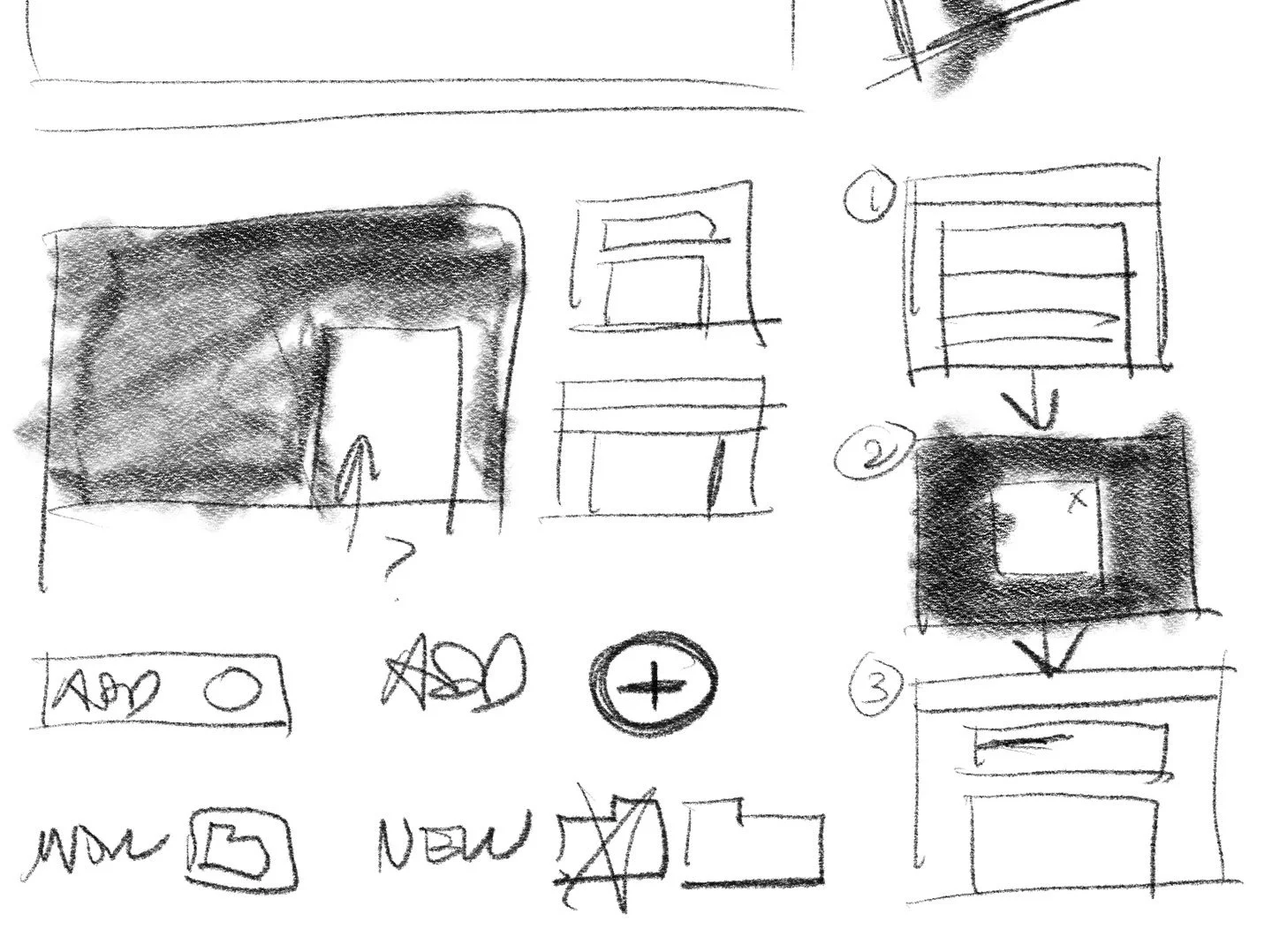
SKETCHES/WIREFRAMES
To move this project along quickly, I created a couple quick pencil sketches, but then moved on to wireframing in Figma. This page uses established design patterns and components, so it was just as easy to move into a formal “wireframe” that was really more of a comp. This allowed me to iterate quickly and get to a couple of ideas that I could share with the Product Manager.
UI DESIGN
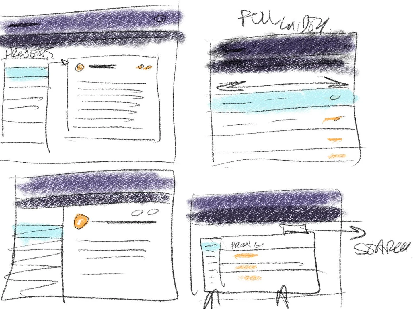
After the PM and I were comfortable with the direction, I mocked up the pages as more formal designs in Figma, using the visual systems I had already established on the live site.
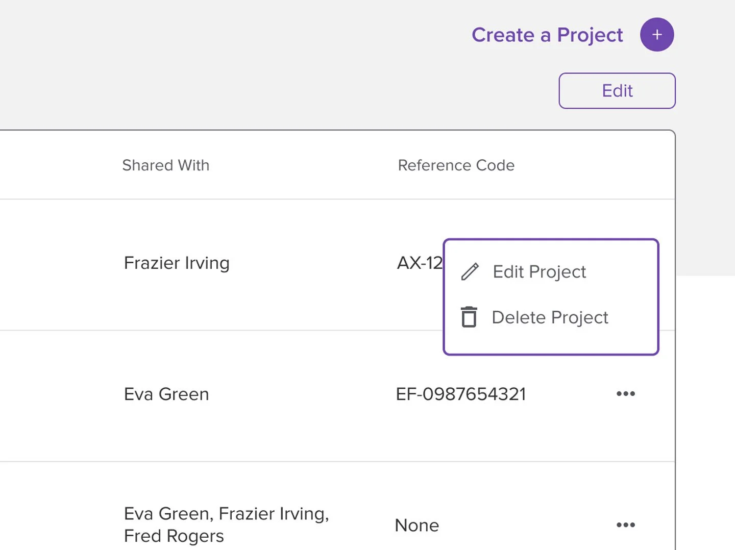
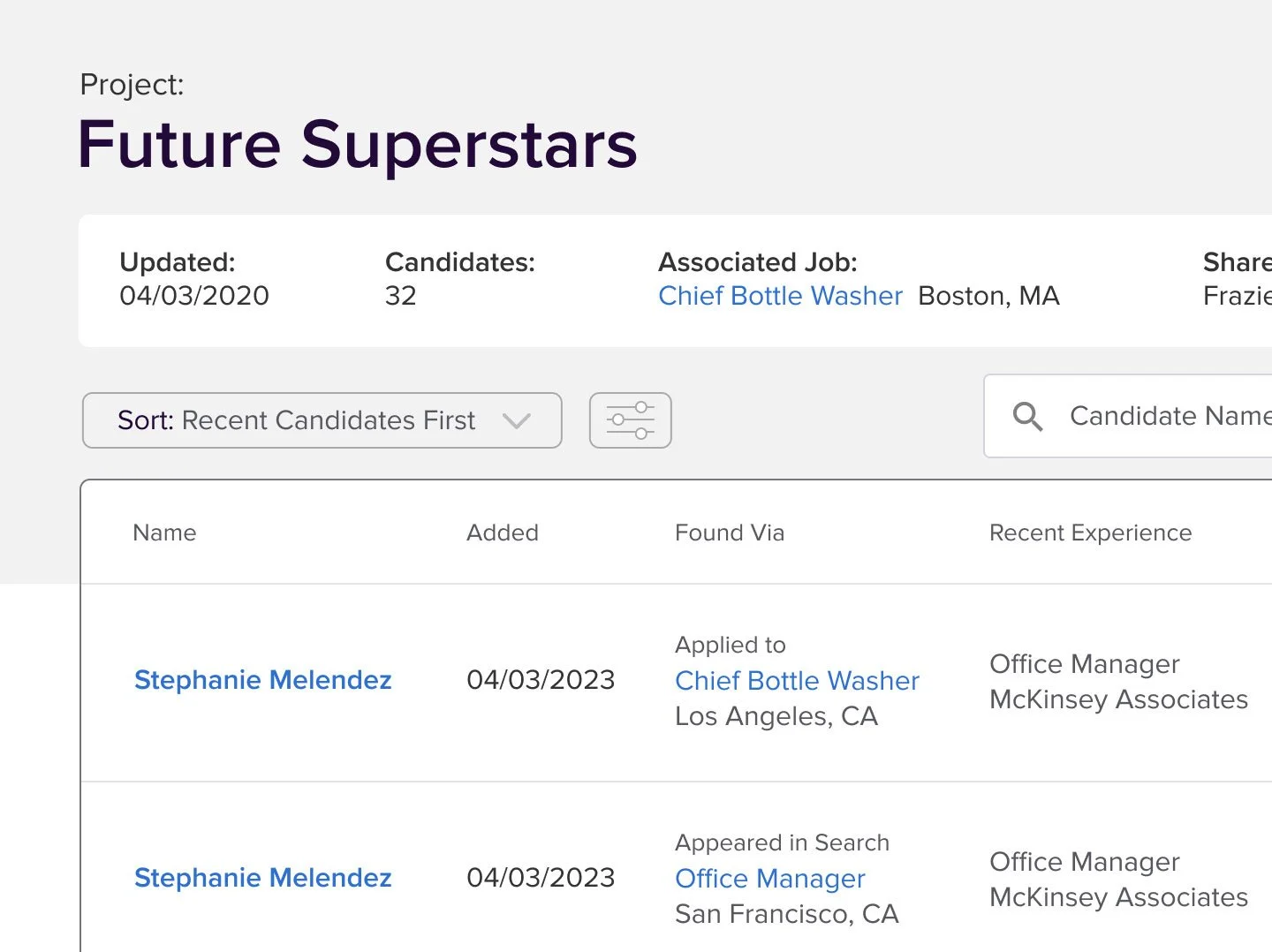
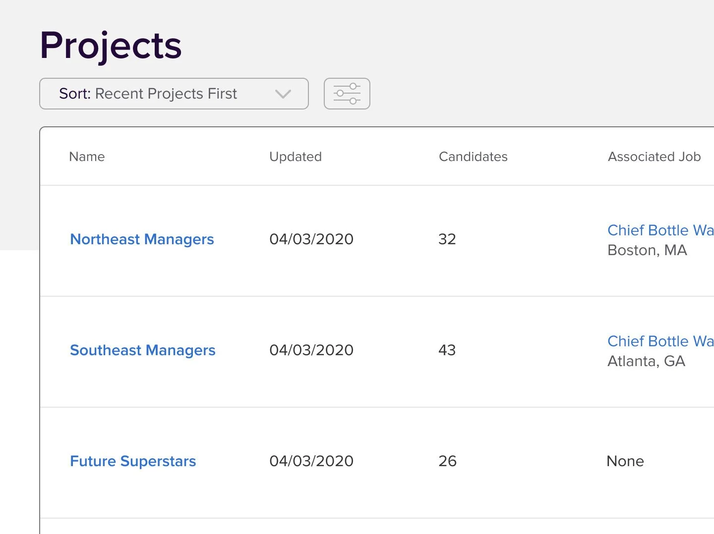
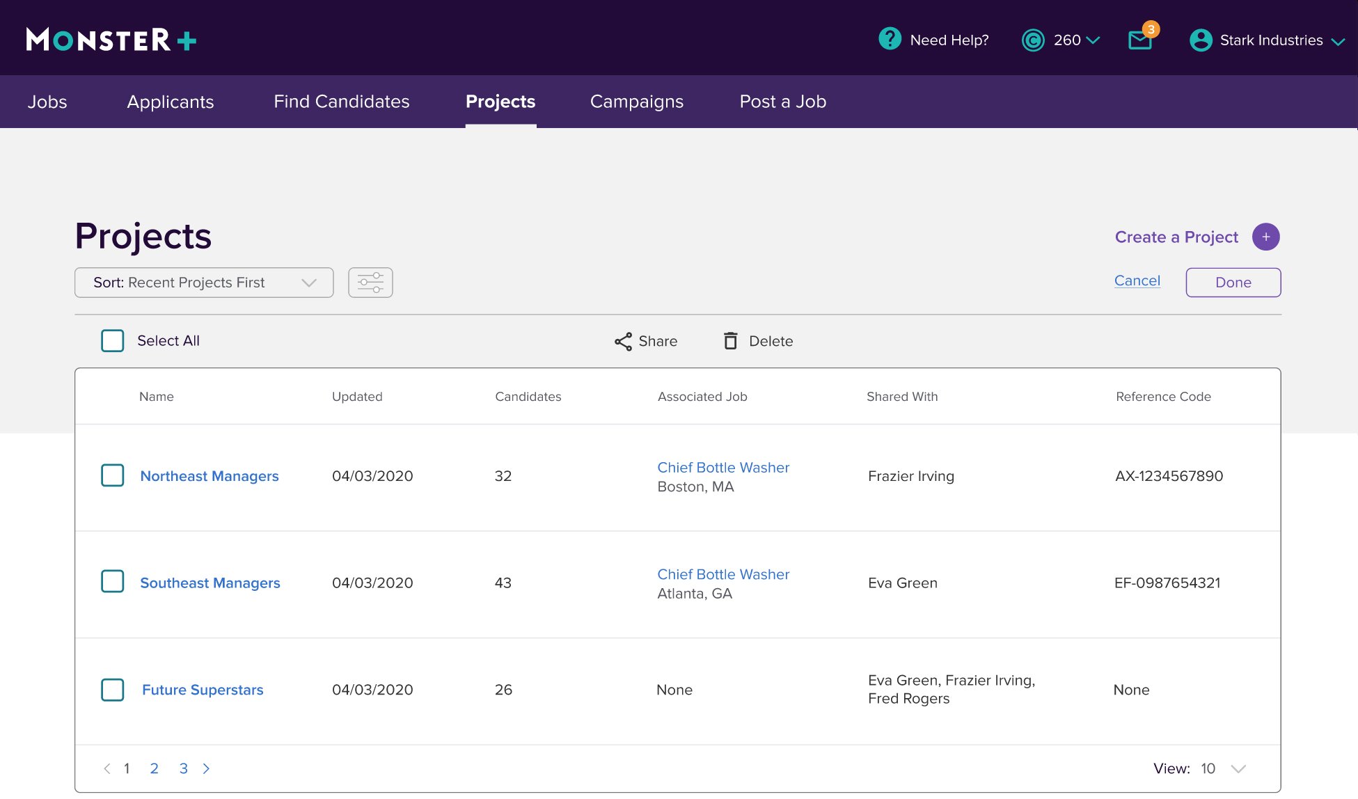
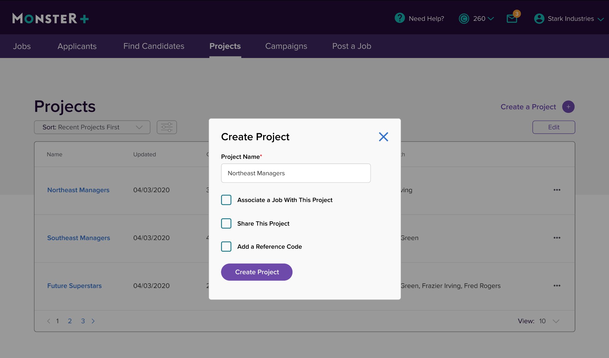
The concept we initially went with was a new interpretation of the “folders” feature we had in the old system. It would be easy to implement on the back end, offer users flexibility and customization, but it would have a more modern UI. We decided to call this the Projects page. It would allow the user to create a Project, which is essentially a folder or bucket in which they can save related jobs listings, candidates and applicants. Users could label a project by location, job title, or other custom internal codes or names.
TESTING
Testing showed that we were WAY off with what our users wanted. While they appreciated the flexibility of the Project system, they didn’t think of their open jobs that way. They would rather use the Jobs page we already had, which allowed them to search for listings by name, location, or job code.
What they did like about this approach, however, was that they could see Applicants AND Candidates in one place. It saved them several clicks and page loads in the Candidate Search tool, which would add up to a lot of time overall in the course of their day-to-day.
ITERATION
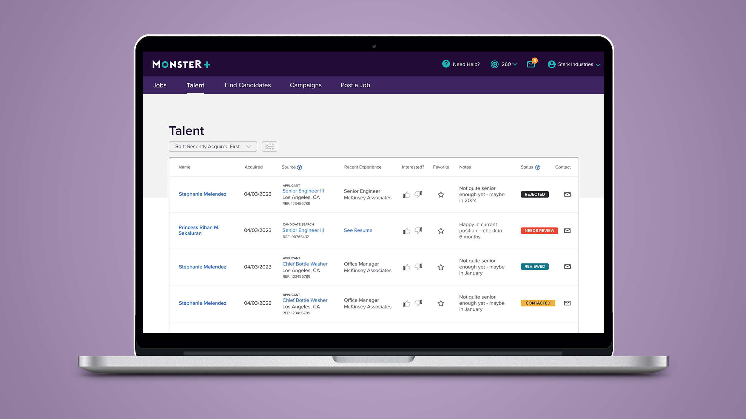
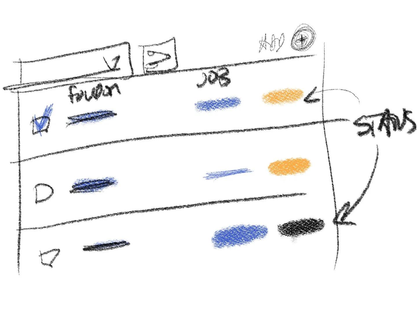
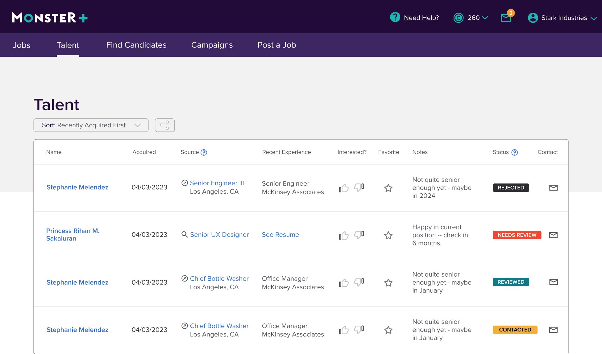
We retooled the design and flow so instead of a new, extra “Projects” page, we would replace the current “Applicants” page with a new one called “Talent”. This page would include both Applicants and Candidates, and would indicate how the person was sourced.


FINAL DESIGN
The final design met the needs we heard from our users, allowing them to review, manage and search for potential new employees in one location, without adding excess features or bloating the site nav.
IMPACT
Due to technical debt and level of effort issues, this project was put on the back burner for implementation. I hope we’ll be able to put it live sometime in the next year.