NORTHEASTERN UNIVERSITY
Course Registration App
Student app for registering and scheduling classes
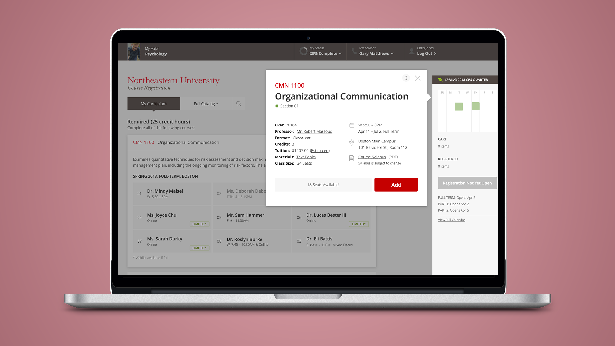
PROJECT OVERVIEW
Founded in 1898, Northeastern University is renowned for its experiential learning model, high-impact research, deep partnerships, and worldwide reach.
Northeastern needed an easier, more intuitive online app for students to view the course catalog and set their personal curriculum for the upcoming semester; one that allows them to view their schedule as it builds and edit it in real time. The administration needed a better online system for students that reduced calls or email to the Help Center.
ROLE
UX/UI Designer
UX flows, wireframes, and UI design
TOOLS
Axure
PROJECT LENGTH
6 Months
METHODS USED
Sketching
Wireframing
Visual Design
Prototyping
UX/UI DESIGN PROCESS
For this project, all research, exploration and discovery work was done by the good folks at ZeroDegrees before I came on board there. I joined the team and set to work on creating the front-end design, using the personas, audits, journey maps and competitive analysis that they had put together.
SKETCHES/WIREFRAMING
Prototyping in Axure, I could sketch in my notebook and then move into clickable wireframes to see how my concepts would play out. Creating a rough prototype allowed me to identity any holes in my ideas, and adjust the flow to fix them.
VISUAL DESIGN
Since Course Registration has many moving parts, and lots of detail to review, the UI design employs a clean, open approach that makes the content accessible and easy to read.
We worked within the Northeastern branding guidelines, but specifically chose neutral colors for the majority of the page so the relevant content pops. The judicious use of red and other bright colors draws the user’s eye to the important pieces of the page.
PROTOTYPING
I created a clickable prototype in Axure that demonstrated to our stakeholders at Northeastern how this UX would benefit students. After client sign-off, I handed off the prototype to our UX Researcher for testing.
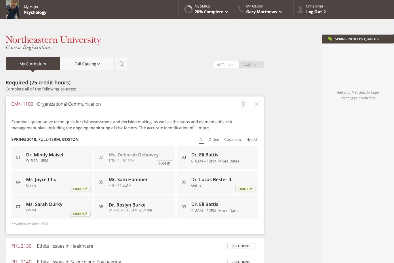
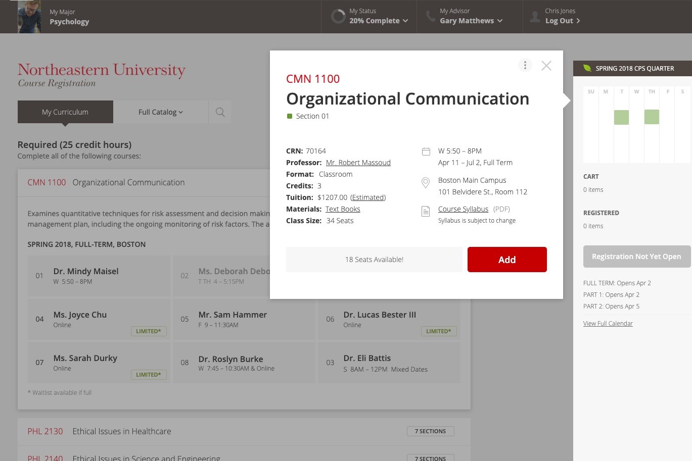


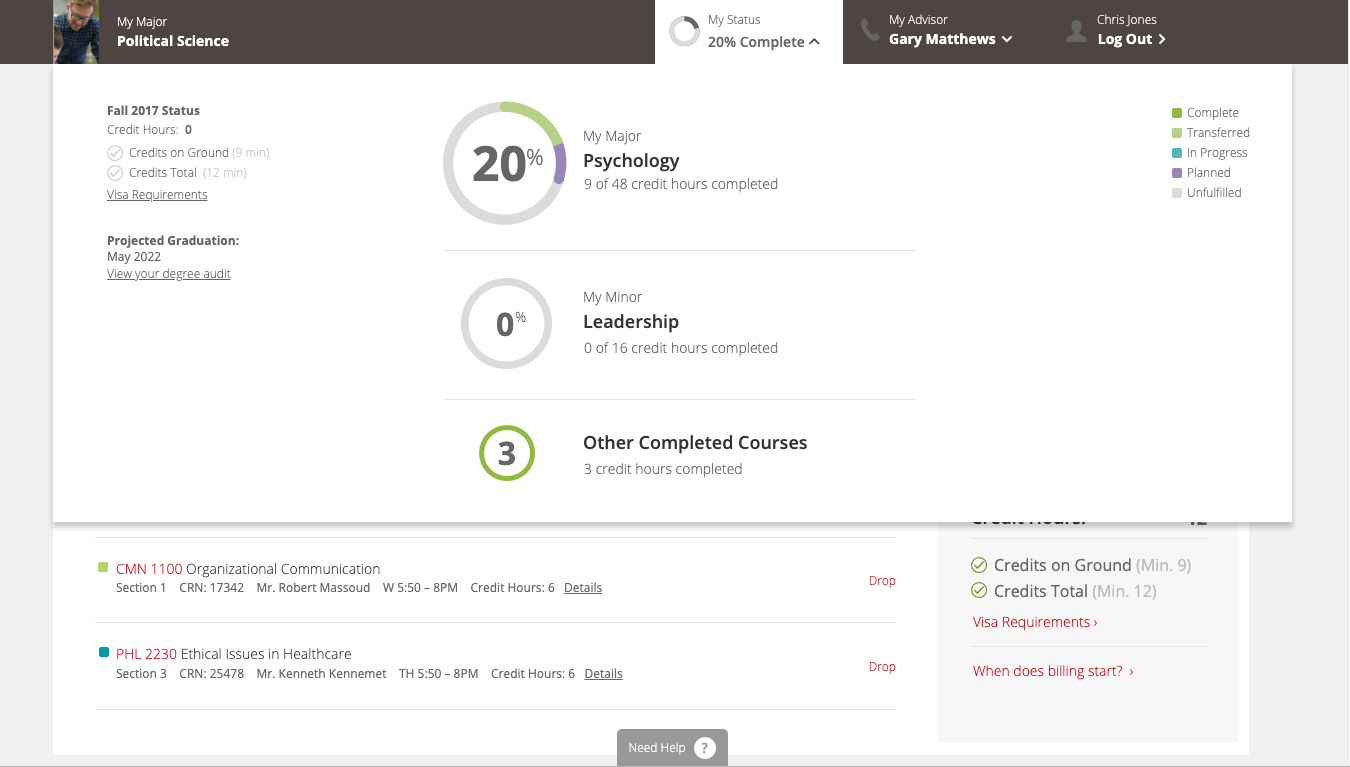
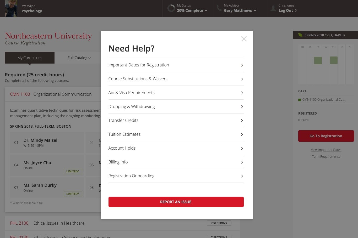


FINAL DESIGN
Testing went well, and a few nomenclature changes came about as a result of the interviews. We also discovered several more sections that needed to be added to the online Help section, which became quite robust.