HIRING.MONSTER.COM
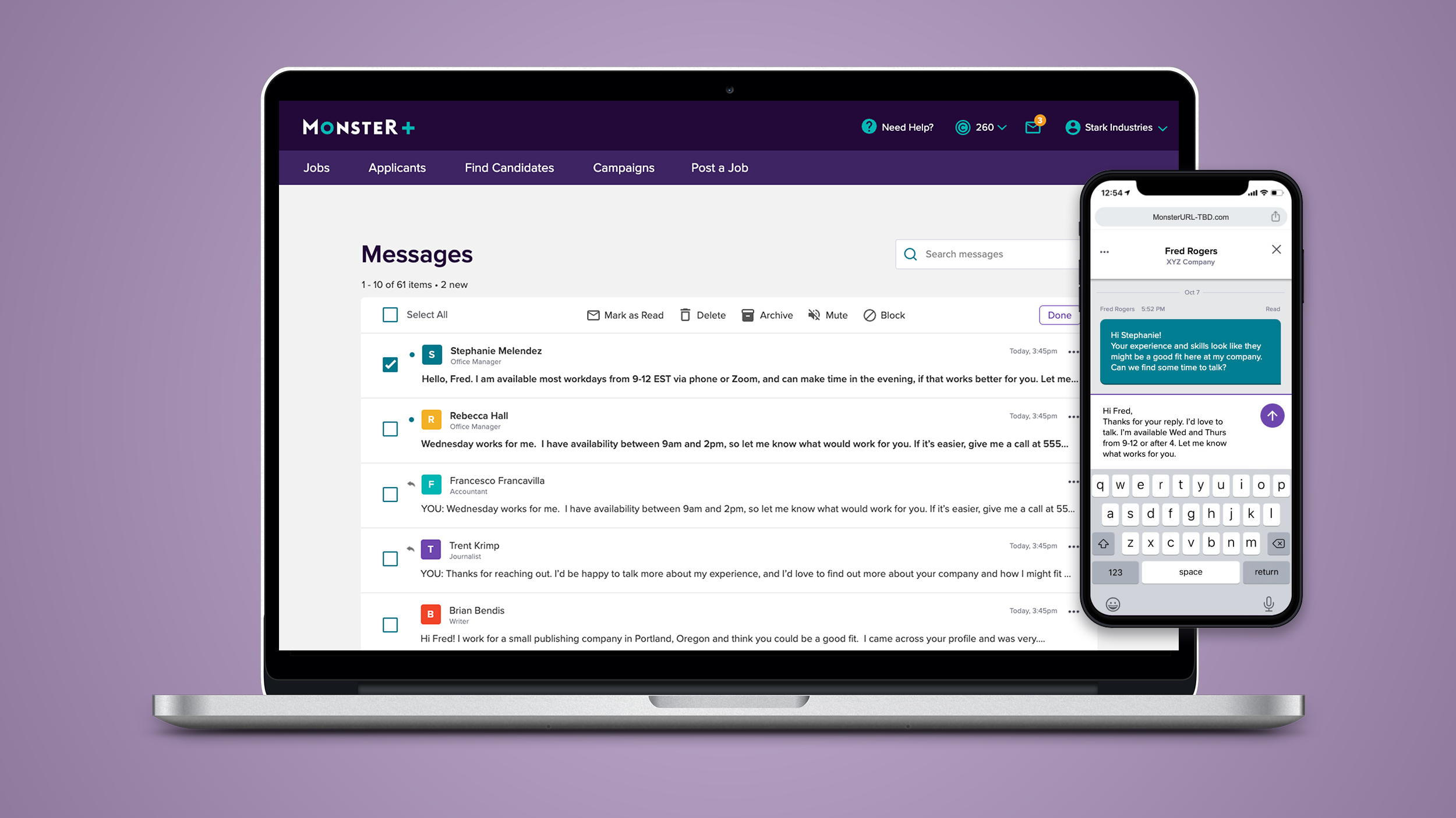
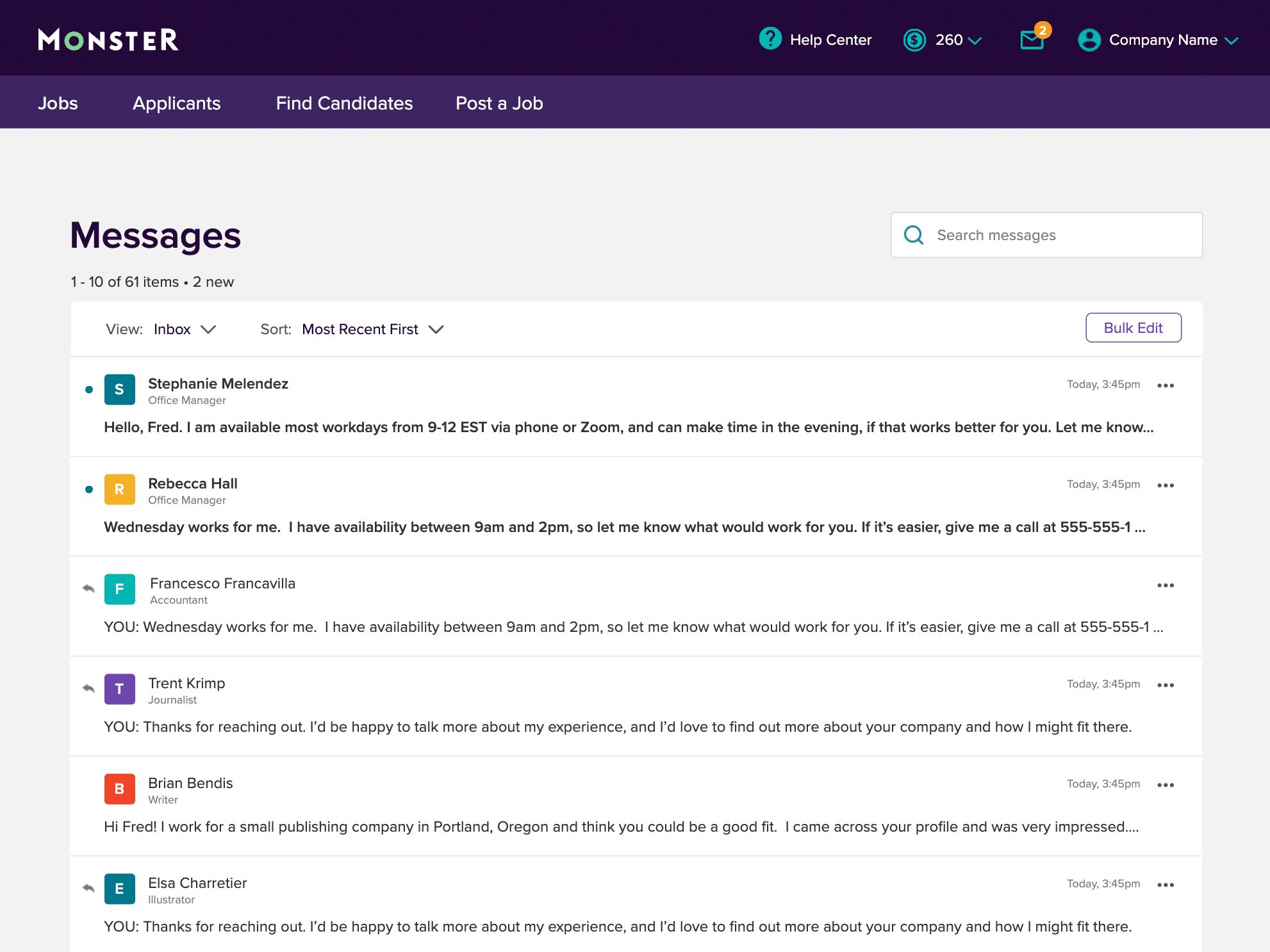
Employer Message Center
A centralized but always accessible spot for Employers to send and receive messages with candidates and applicants.
PROJECT OVERVIEW
Monster is a global leader in connecting people and jobs. For 30 years, Monster has worked to transform the recruiting industry.
Monster’s new employer portal necessitated some changes to the business model and UX flows. Previously, when an employer and a candidate communicated via text or email, they would each get an email with the full message included. After the launch of Monster+, we elected to direct the user to the site to read and reply to any new messages. This would encourage more engagement with the portal and make Monster+ part of our user’s everyday toolkit.
The goal for this project was to create an easy method with which employers can communicate with candidates, a feature that blended seamlessly into their daily workflow.
ROLE
Researcher
Conducted all research
UI/UX Designer
All UX flows, wireframes, prototypes and UI design
TOOLS
Axure
UserTesting.com
PROJECT LENGTH
3 Months
METHODS USED
Competitive Analysis
Wireframing
Hi-fi Prototyping
User Testing
Visual Design
EXPLORATION & DISCOVERY
COMPETITIVE ANALYSIS
The Monster+ Message Center would be a brand new feature, created from the ground up with a new backend. There are already a plethora of products that perform similar functions, so it made sense to pull best practices from industry leaders’ dedicated apps like Google and Apple Mail, as well as online recruiting competitors such as Linkedin, Indeed, and Zip Recruiter. Facebook, Instagram, and other social media also have this functionality baked in, so understanding their flows would make our application feel familiar and be easier to use.
UX/UI DESIGN PROCESS
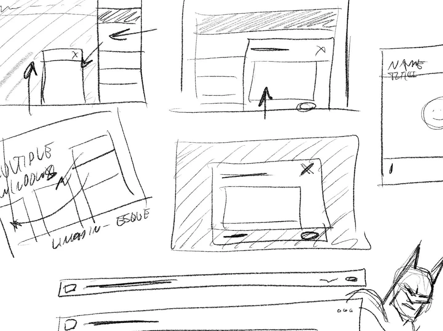
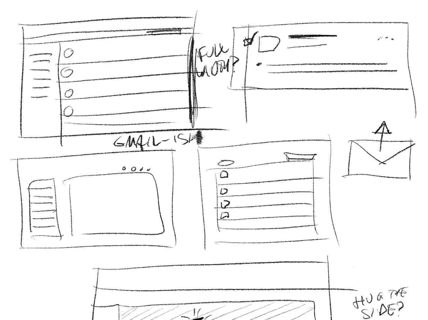
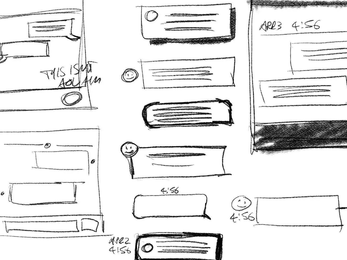
SKETCHING
As I reviewed competitors’ sites, I took notes in the form of pencil sketches, jotting down features and details that I thought would work well for Monster+. I love sketching because it allows me to think visually in a stream of consciousness – my thoughts can get down on paper almost as quickly as I’m having them, and then iterate within seconds.
FLOWS
Sketches lead directly into flows. As I’m sketching the UI and the related pieces, elements group themselves into pages, and then rough flows.
From the roughs I create a more formal flow in Axure, which helps me flesh out the pages, features and items needed for a complete, thoughtful user experience.
WIREFRAMES
The live app had already established my visual systems and components, so creating formal wireframes would have taken just as much time as laying out the comps. The Product Manager and I agreed to skip over this step to speed up the process.
COMPS/PROTOTYPE
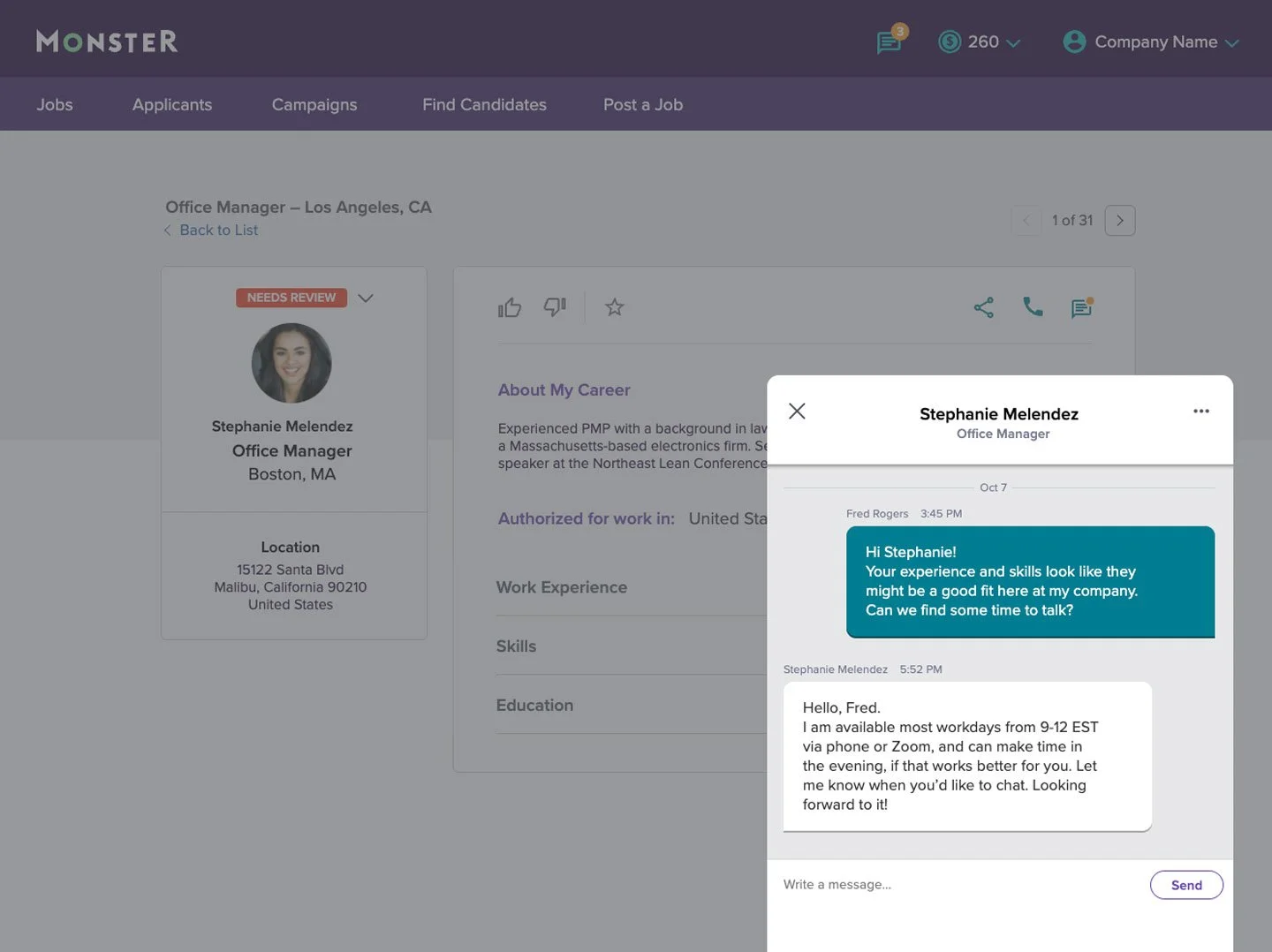
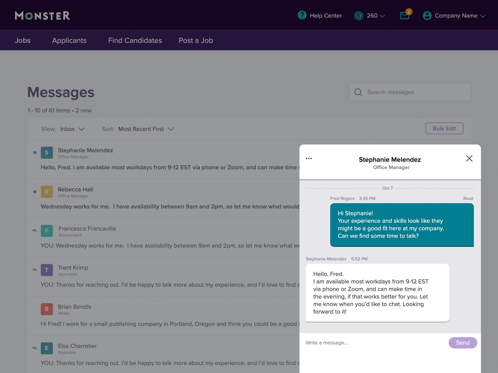
Once the main Message Center “Inbox” page had been designed, most of the design work was a series of micro-interactions in the pop-up messaging window. Axure allows me to prototype things very quickly, so I created working mock-ups of the entire flow rather than static comps.
This method of design helps me sell my ideas better to stakeholders, as they don’t need to imagine any element of the product – it’s all there, in front of their eyes, working (with dummy data or content) in real-time. And after I present it, they can play with it as they consider their feedback.
TESTING
The schedule for this project was tight, so I ran a series of unmoderated sessions with users on UserTesting.com for a basic “thumb in the wind” test, to see if what I had designed made sense to users.
Overall, people thought it made sense and felt in keeping with several other online tools they use.
ITERATION
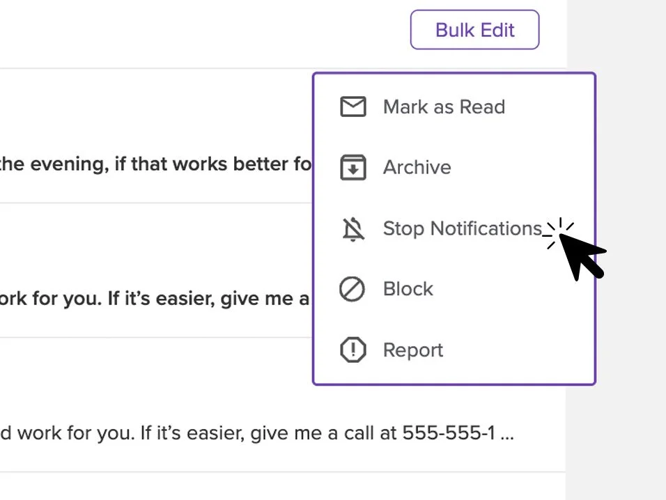
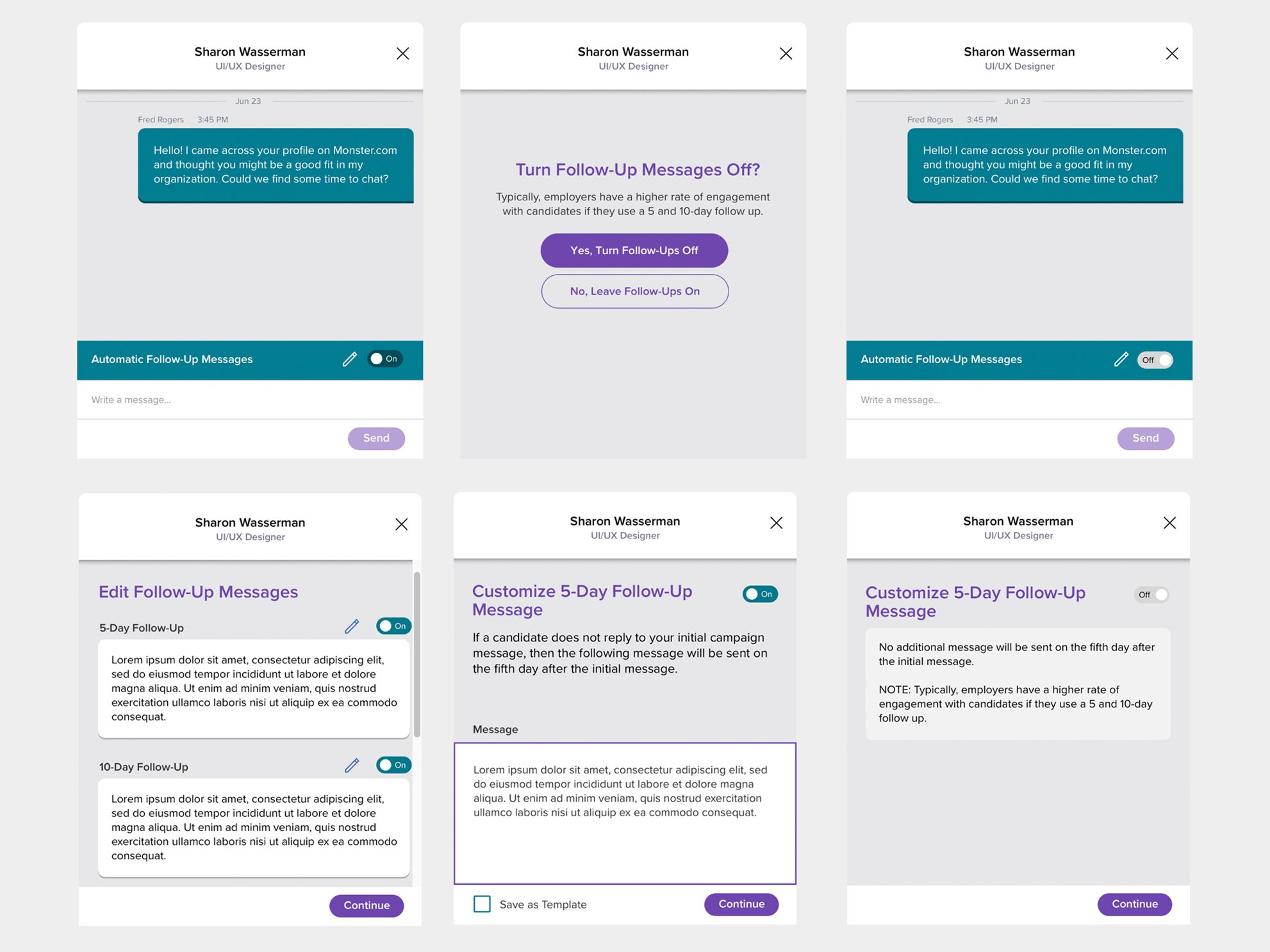
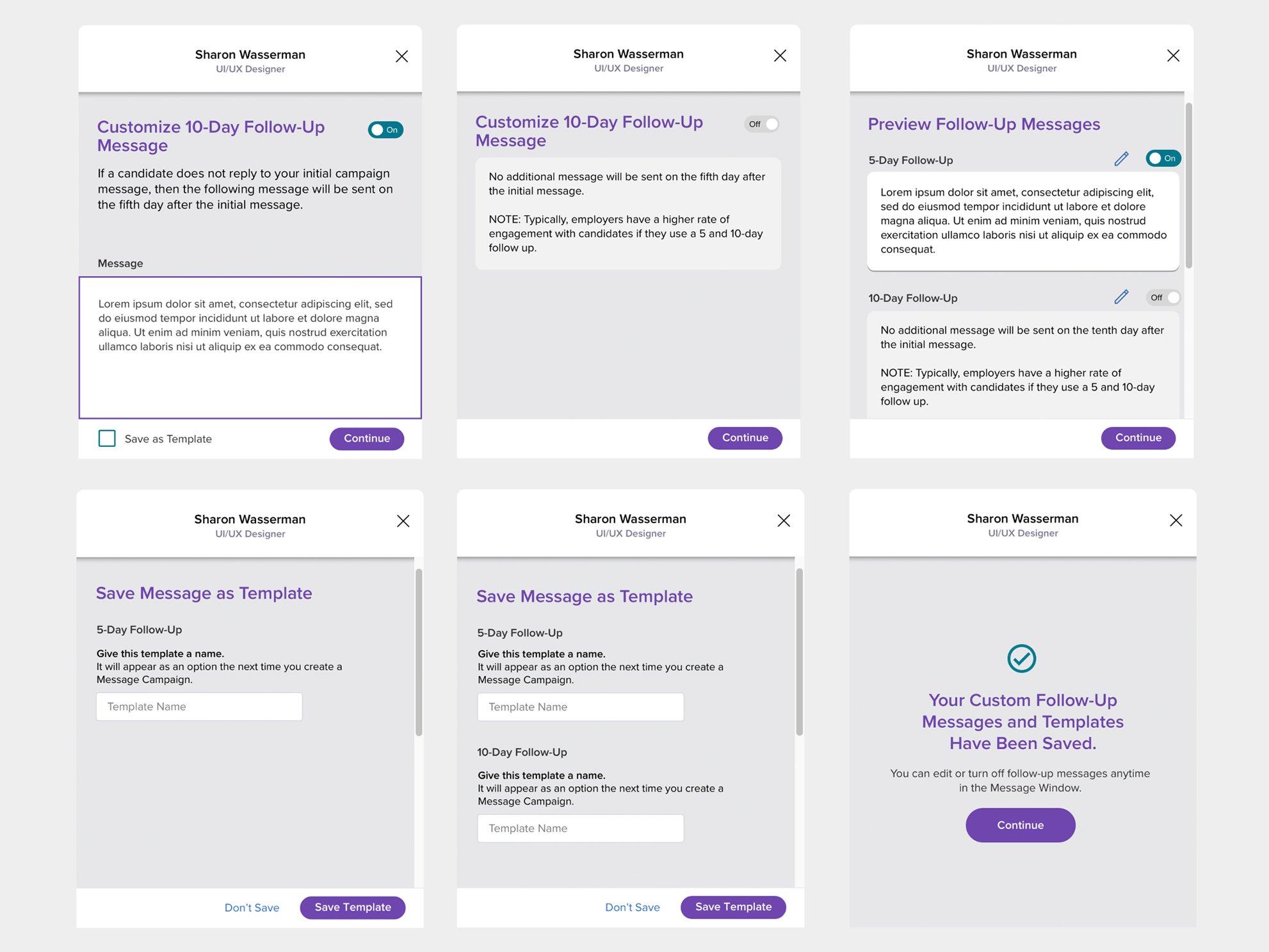
There were a few piece of feedback that I went back and incorporated into the designs; placement of the messaging window was tweaked, some of the labels and language were changed to be more clear, and we ended up adding a visual scroll bar so that users understood when there was more content below the “fold” of the pop-up window.

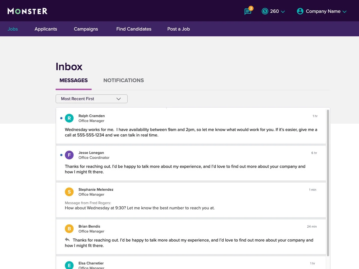
FINAL DESIGN
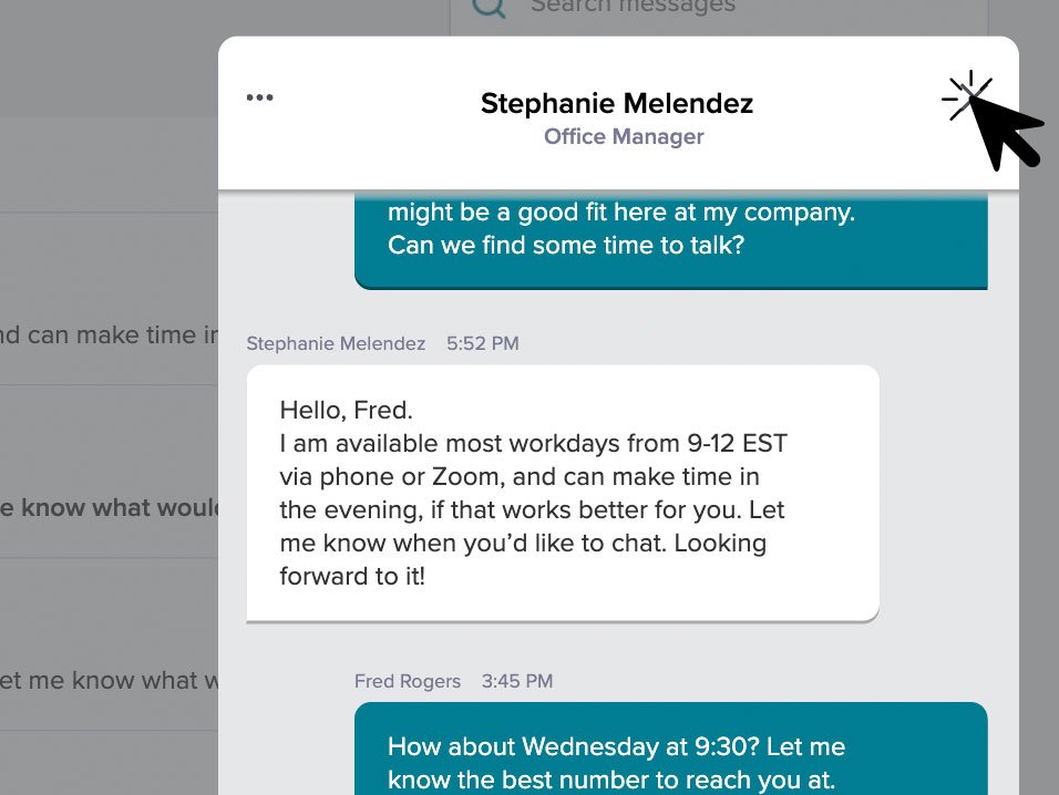
In keeping with the look and feel of the rest of the site, the Message Center employs a clean interface with lots of negative space. Users told me that the design was “cleaner than other tools” and “easy to scan”.
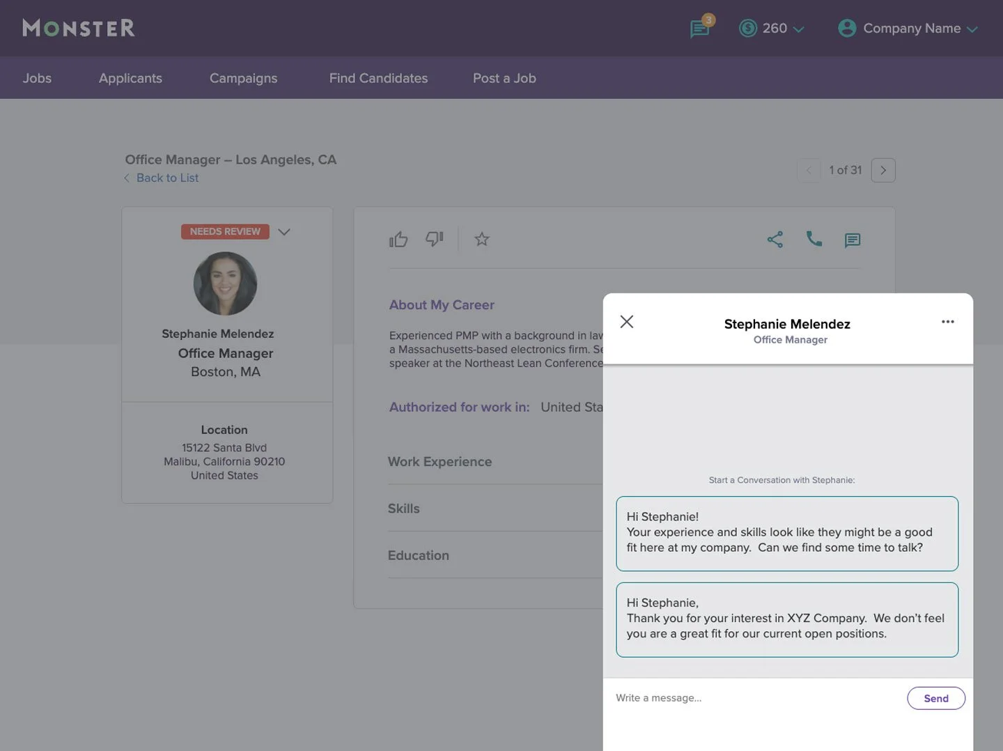
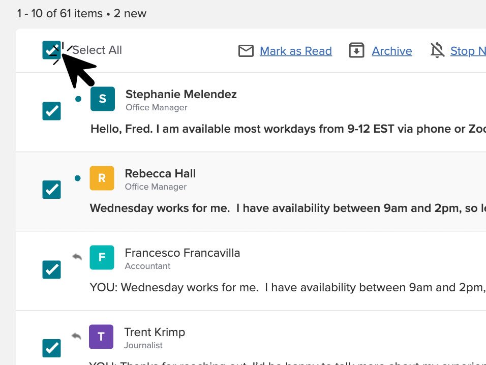
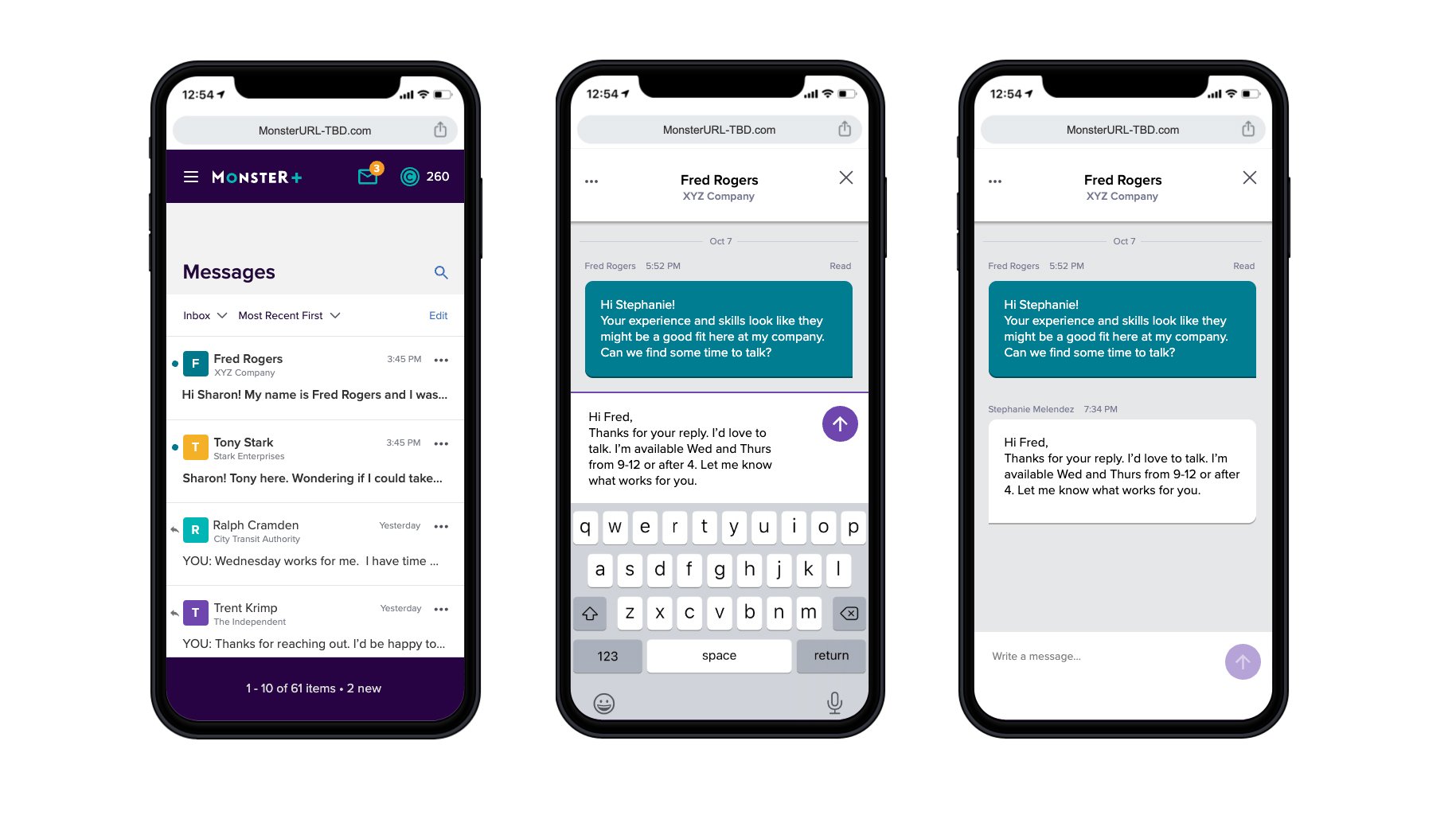
Though there is a central “hub” for the Message Center in the form of the Inbox, messaging can be engaged with around the site. Whether the employer is reviewing applicants or searching for candidates, they can contact the user directly on the existing page, removing the need to click over to the Inbox, and allowing them to stay in the flow of their current task.
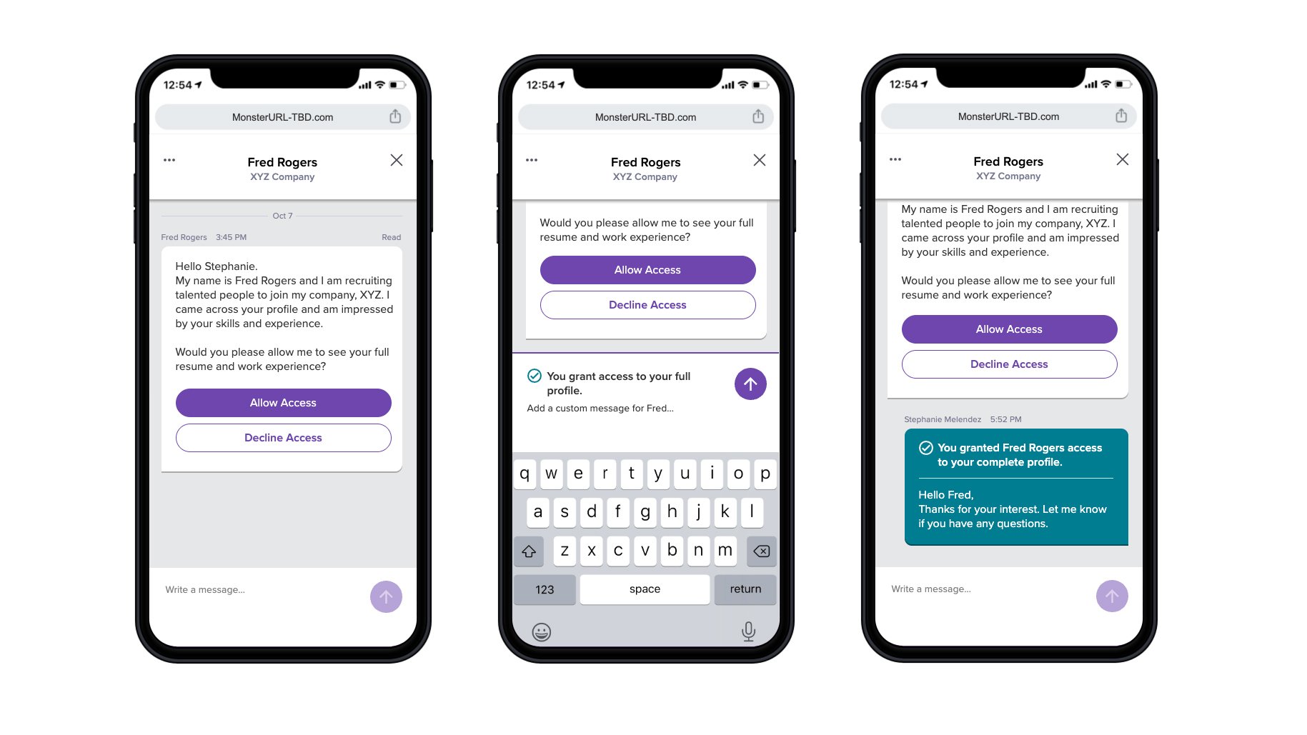
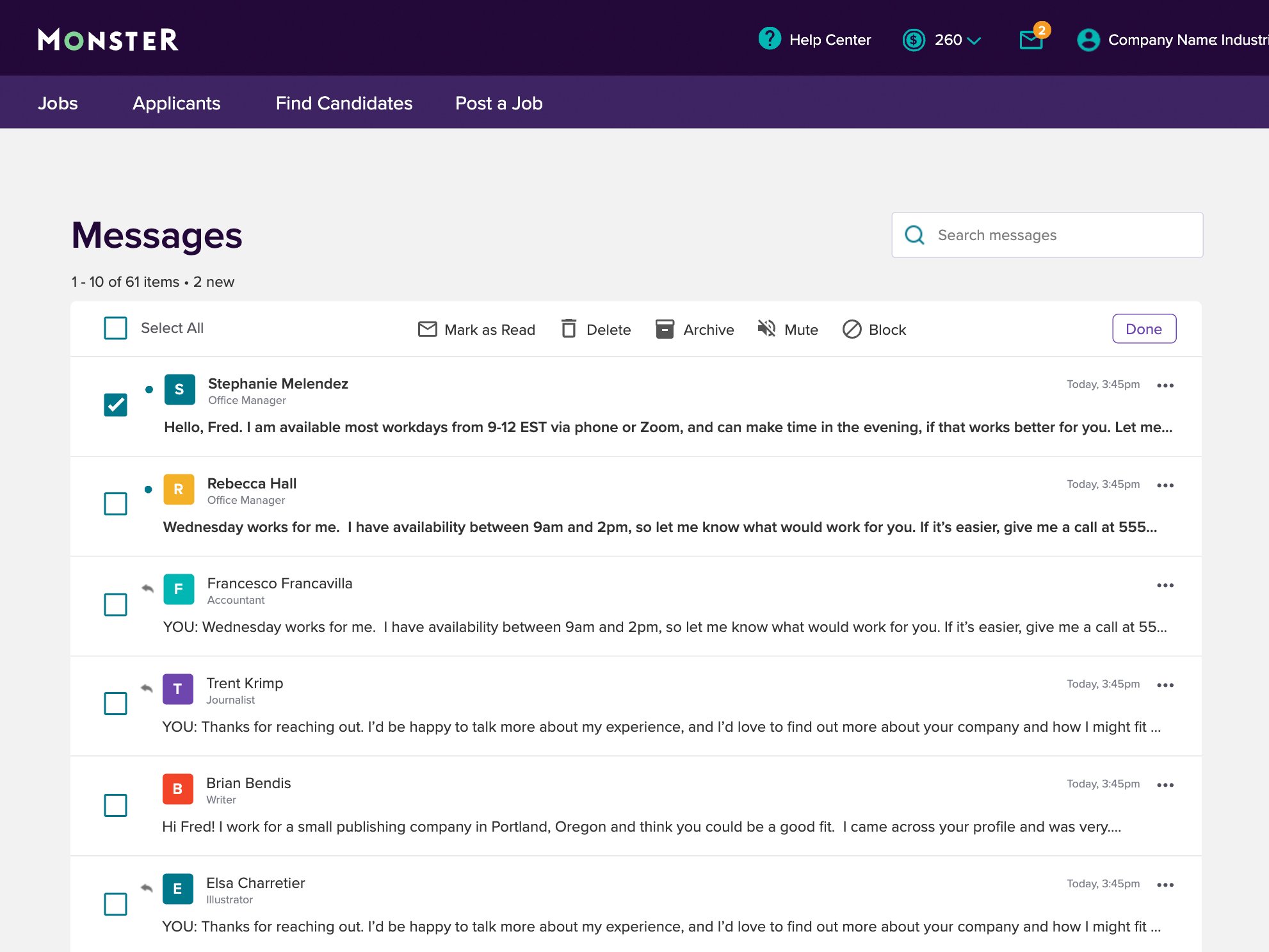
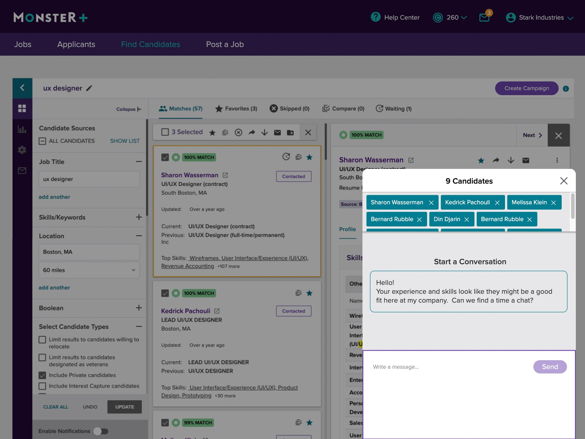
This final design also accommodates several different types of messaging: DMs, bulk messaging (to more than one candidate), automated follow-up messages, and the creation of messaging campaigns that will ping similar candidates as they become available in the Monster+ system.
IMPACT
Customer engagement in the application is up 64%