HIRING.MONSTER.COM
Monster+ UX/UI Design
A long overdue glow-up for Monster’s newly launched self-service employer application.
PROJECT OVERVIEW
Monster is a global leader in connecting people and jobs. For 30 years, Monster has worked to transform the recruiting industry.
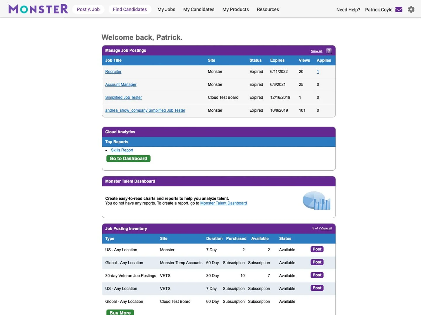
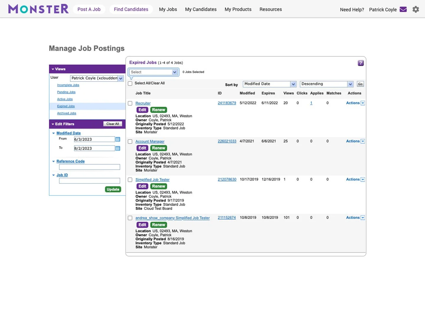
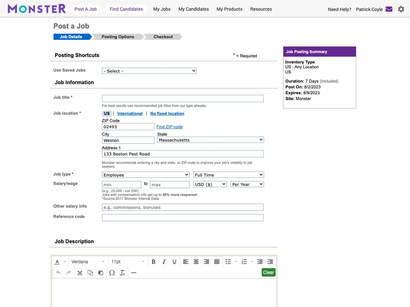
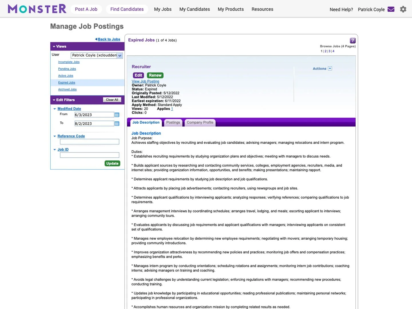
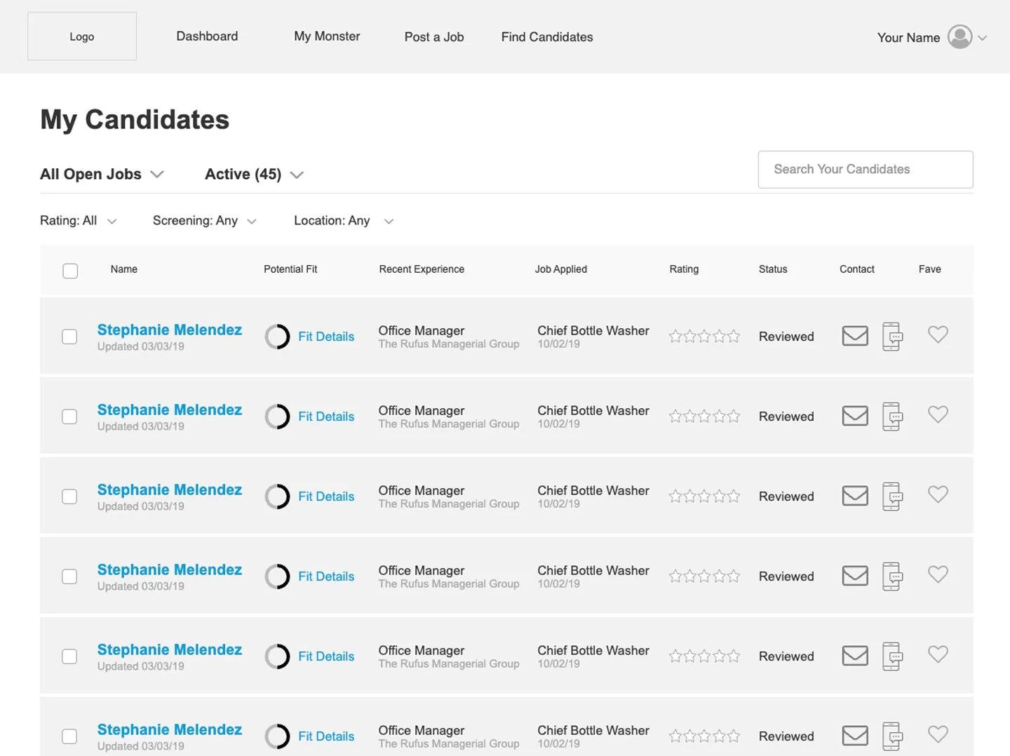
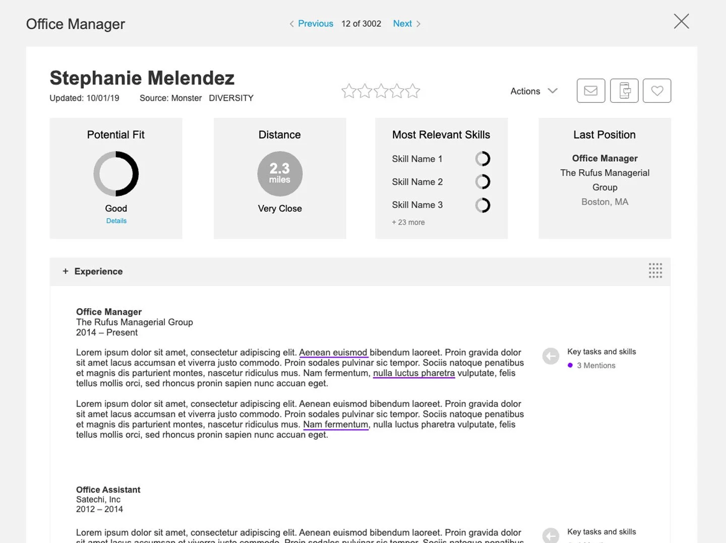
Hiring.Monster.com is an Employer portal that allows business owners, hiring managers, and recruiters to post & promote job listings, source candidates, and review and manage applicants.
After creating a hi-fi prototype as a proof of concept of the new business model, rigorously testing it with users, and then selling the approach to internal stakeholders, it was time to flesh out the look and feel of the new UI and dig into the micro-interactions that would define this experience.
Goal: Design a B2B interface that is engaging, on-brand, and intuitive enough for a userbase with a varying degree of tech savvy.
ROLE
UX/UI Designer
Created the look and feel, prototyped new features and interactions with an eye for accessibility and ease of implementation.
TOOLS
Axure
UserTesting.com
Adobe Suite
PROJECT LENGTH
3 Months
METHODS USED
Wireframing
Visual Design
Responsive Design
Hi-fi Prototyping
User Testing
EXPLORATION & DISCOVERY
PERSONAS
I created our personas during the previous project, based on several dozen interviews with people in our demographic. The personas we moved forward with were: Emily, the Small Business Owner, and Ashley, an HR Generalist. Emily represents 65% of our projected new userbase (organizations with between 5 and 50 employees), and Ashley 30% (organizations with 50-250 employees).
Throughout the design process, I referred to these personas to make sure I was keeping their needs in mind. This also gave me a good foundation of other sites to draw on for competitive analysis.
COMPETITIVE ANALYSIS
Monster’s B2B product had not kept current with modern UX/UI conventions. So taking a good look at our competition would identify industry best practices, and discover places where we could potentially differentiate ourselves.
I reviewed many competitors, including Linkedin, Indeed, Craigslist, Facebook, Zip Recruiter, Simply Hired, and Flex Jobs. I found that the majority of our competition was already targeting the new demographic Monster was now aiming for, and they made it as simple as possible to create and post multiple jobs.
In addition to competitors, I looked at other related sites our personas used in the course of everyday business, including Squarespace, Shopify, MailChimp, and other B2B and SAAS companies.
After reviewing the competing sites and taking copious notes, it made sense to audit the existing Monster Employer Portal.
UX AUDIT
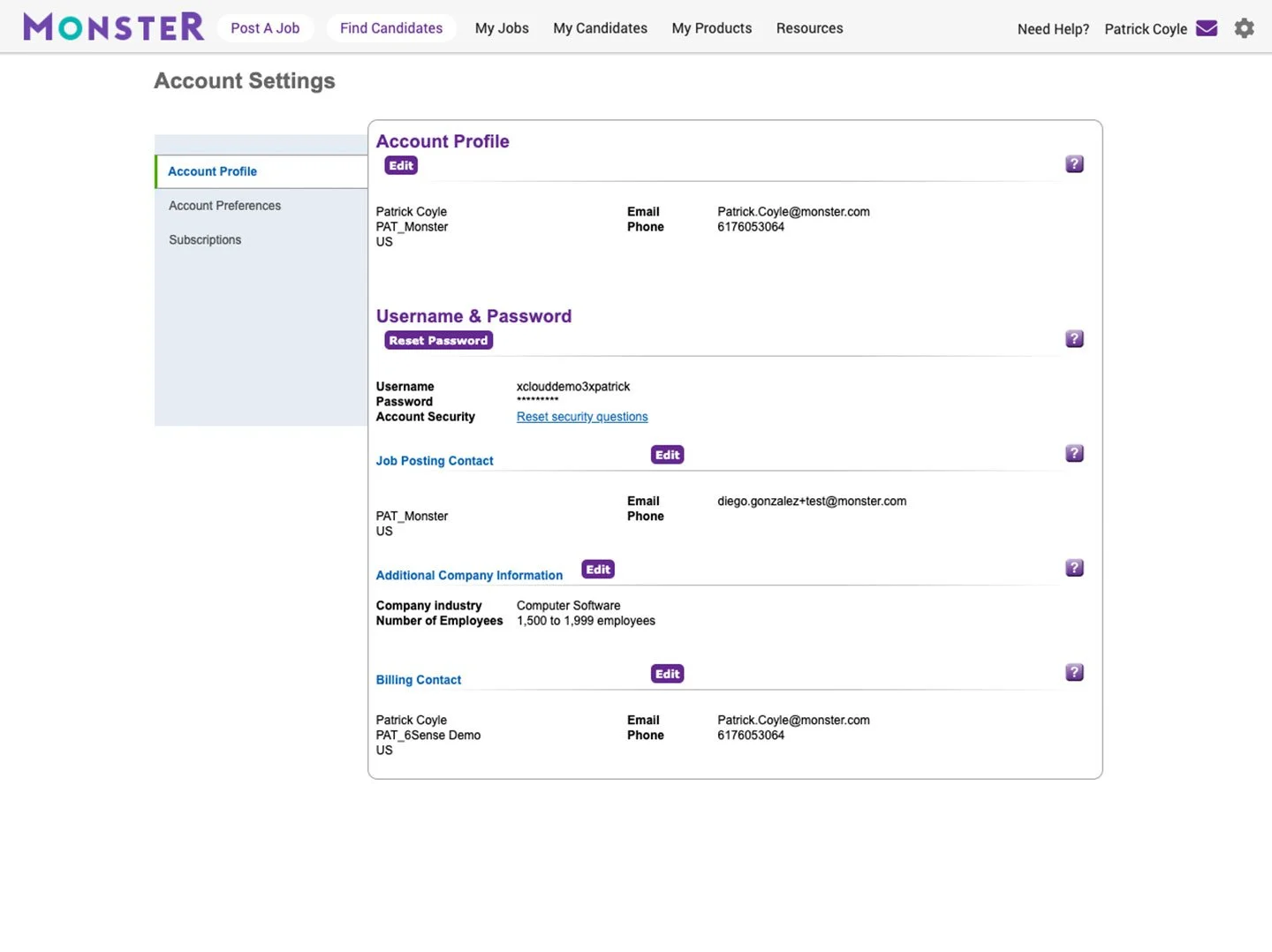
The existing Monster Employer site had a confusing taxonomy with redundant navigation and a clunky UX with many tacked-on features. The UI wasn’t intuitive and was severely outdated in look and feel. In the previous project, I started from scratch to re-imagine the features and functionality of the new Monster Employer app, so it made sense start from square one for the UI as well.
UX/UI DESIGN PROCESS
FLOWS
The initial prototype I built for the proof of concept for our new B2B application was all broad strokes. Now I started creating the flows for our micro-interactions of the elements that most of us take for granted: Warning messages, forgotten password flows, button states, etc. – everything that adds up to a cohesive UX experience.
WIREFRAMES
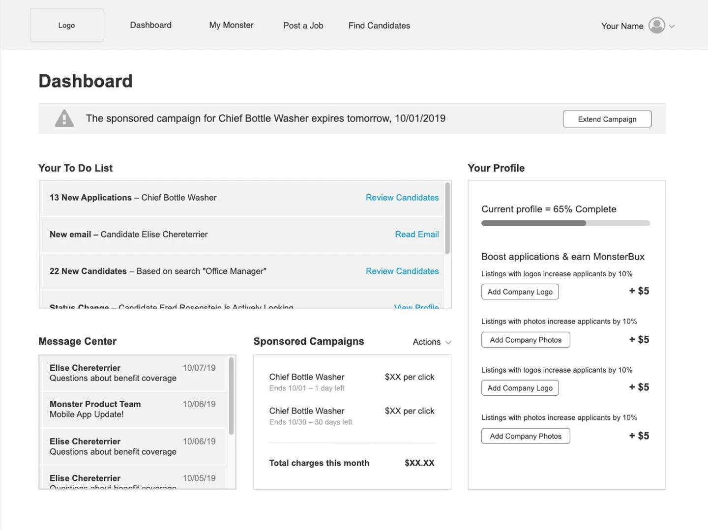
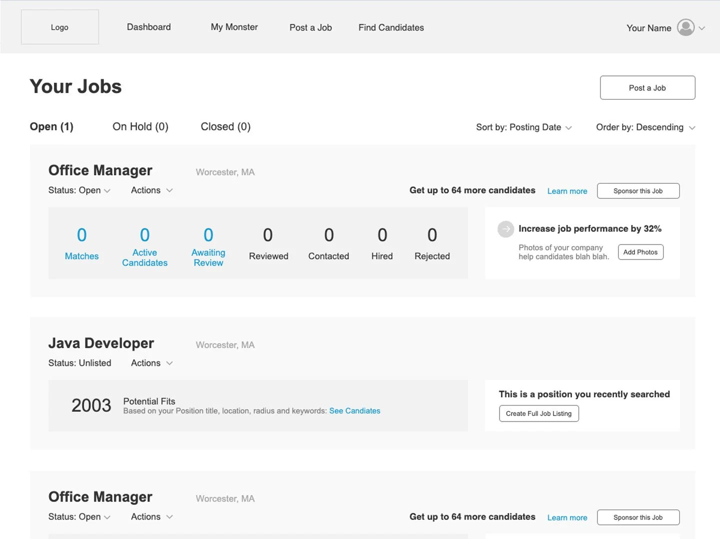
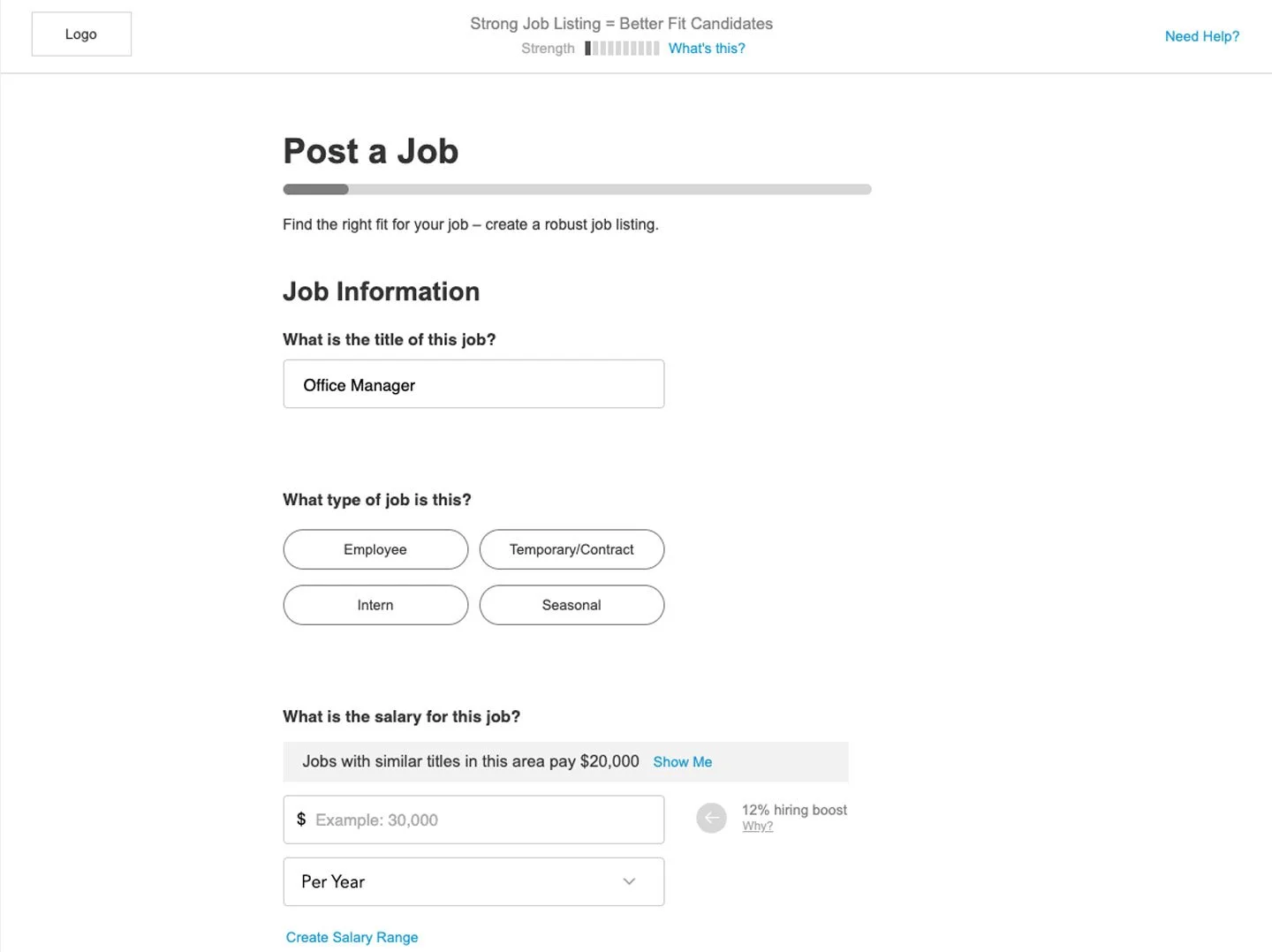
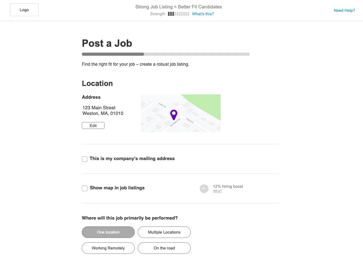
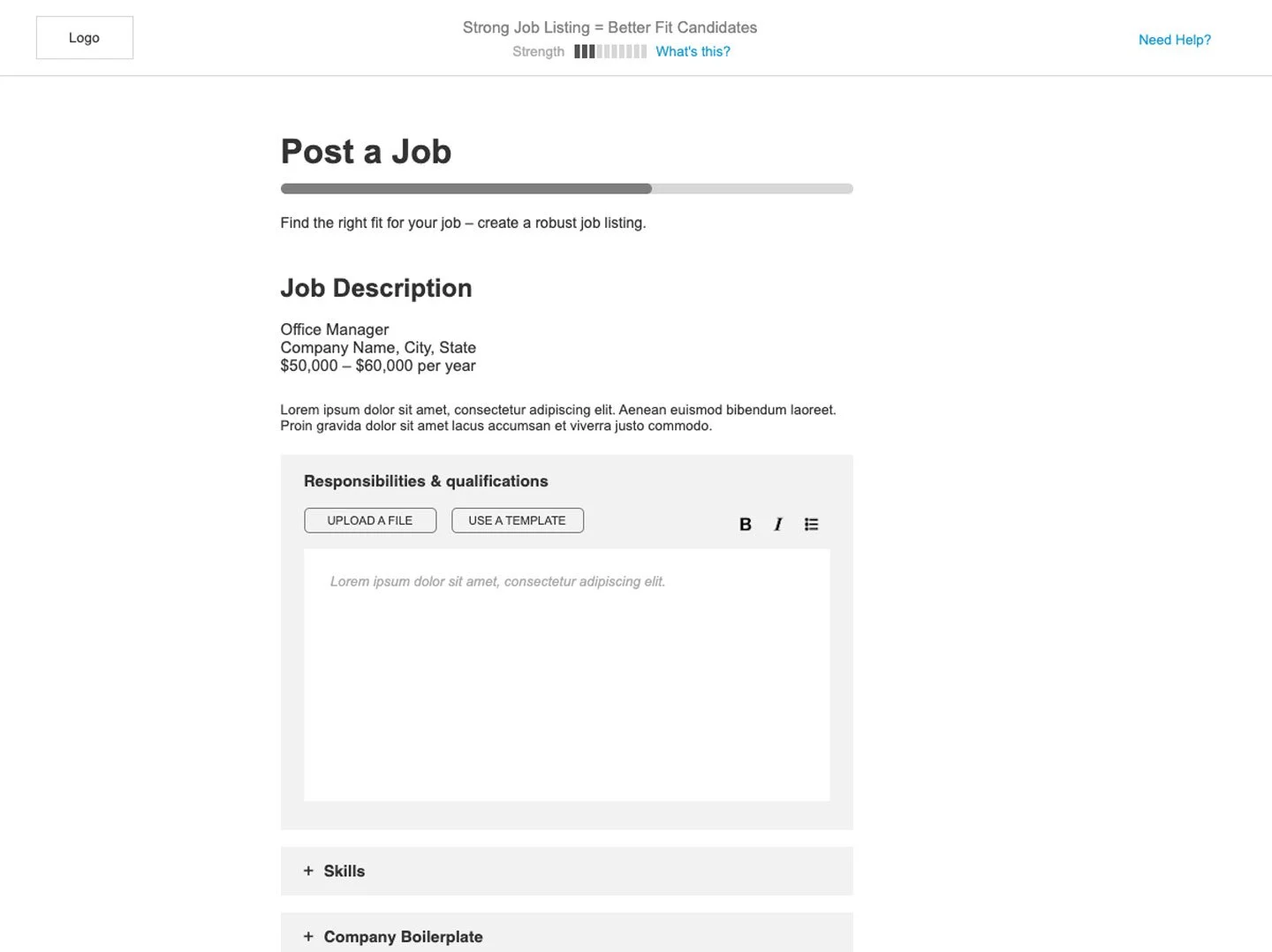
For all the new elements, I would first wireframe them in greyscale to ensure we had all the elements and the interactions incorporated.
COMPS
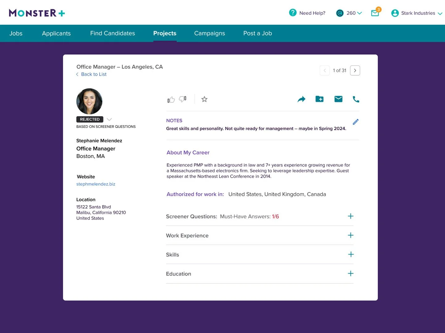
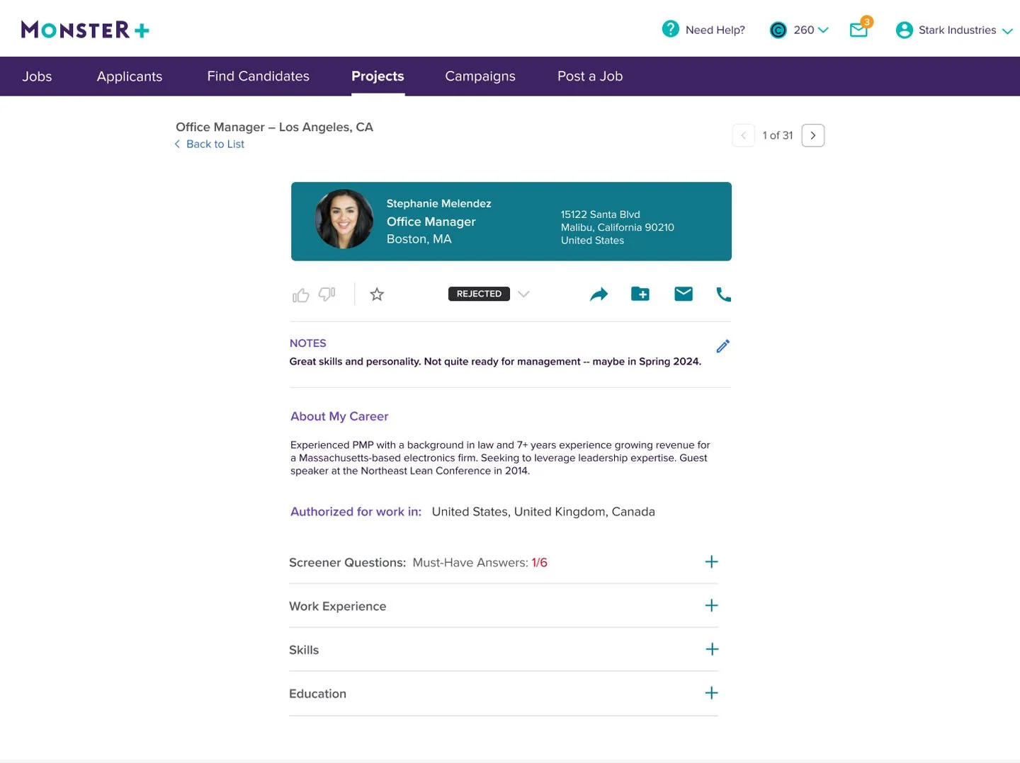
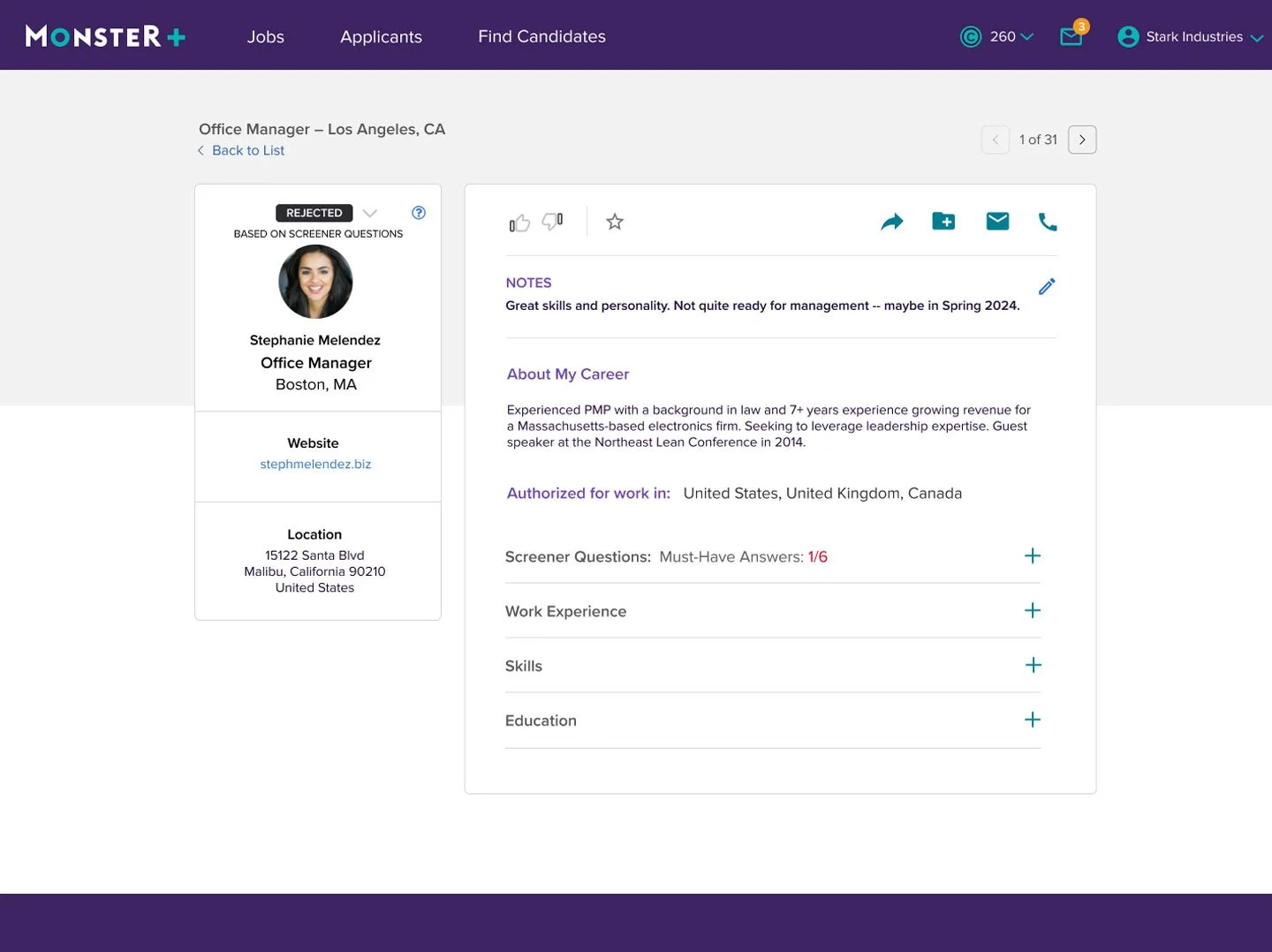
Using the wireframes as my blueprints, I played with palette, typeface, layout and negative space to create a few different look and feel options, which I presented to my internal stakeholders for an initial gut-check before putting in front of users.
TESTING
I tested the visual approach in several dozen unmoderated sessions with our targeted personas, asking which approach appealed to them, and why. We had both qualitative and quantitative feedback on the three directions, asking things like “how does this make you feel?” and “Please rate how easy this page is to understand on a scale from 1 to 10”.
After reviewing the sessions, I was able to determine which direction worked for the majority of users. I presented the findings to my internal stakeholders, and I then iterated on the designs based on the feedback gathered in testing.
ITERATION
I iterated on the look a feel over the course of a few weeks, testing each round with users to make sure the design continued to resonate with them. During this time, I worked with the dev team to see what changes could be made to make the design easier to implement, and to ensure that everything was compliant with web accessibility standards.
Our site exists in twelve countries and in as many languages, so I took care to ensure there was enough room for translations. We use an external translation service, whom I consulted and got some initial phrases and terms localized for each site, dropping them into the design and adjusting as needed.
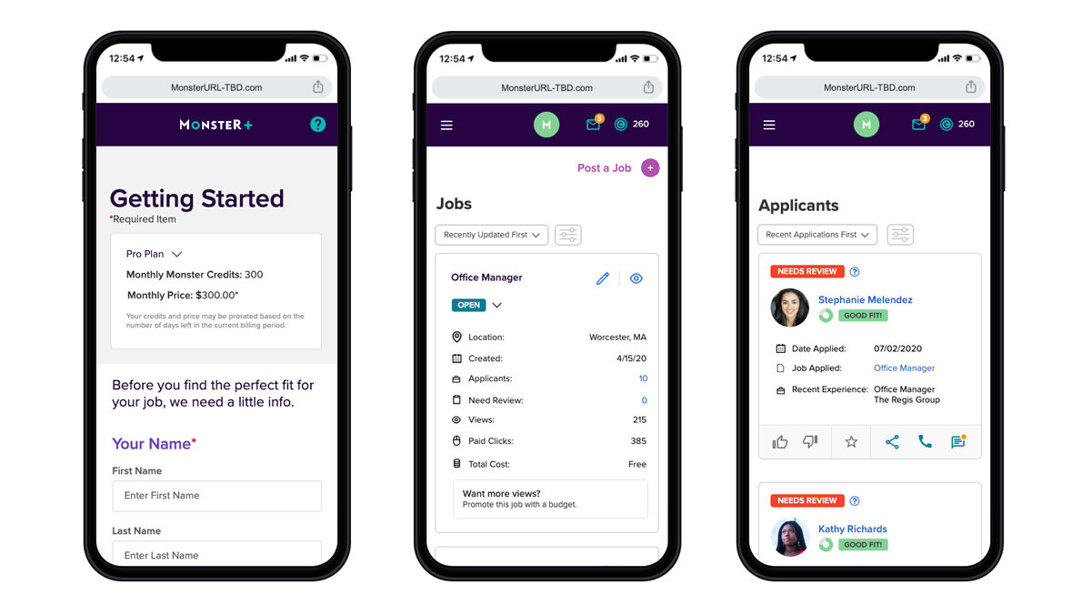
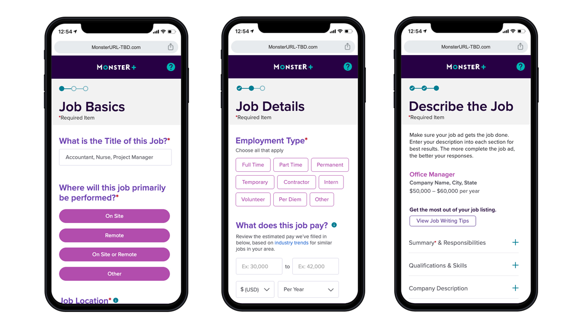
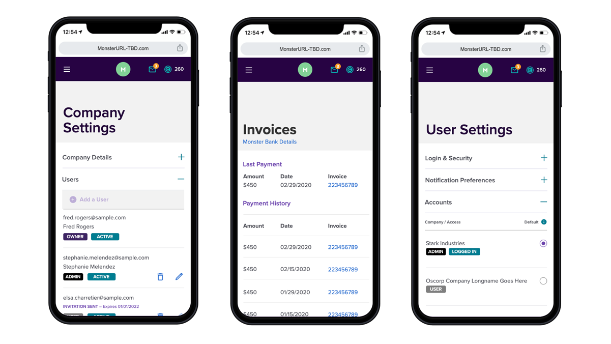

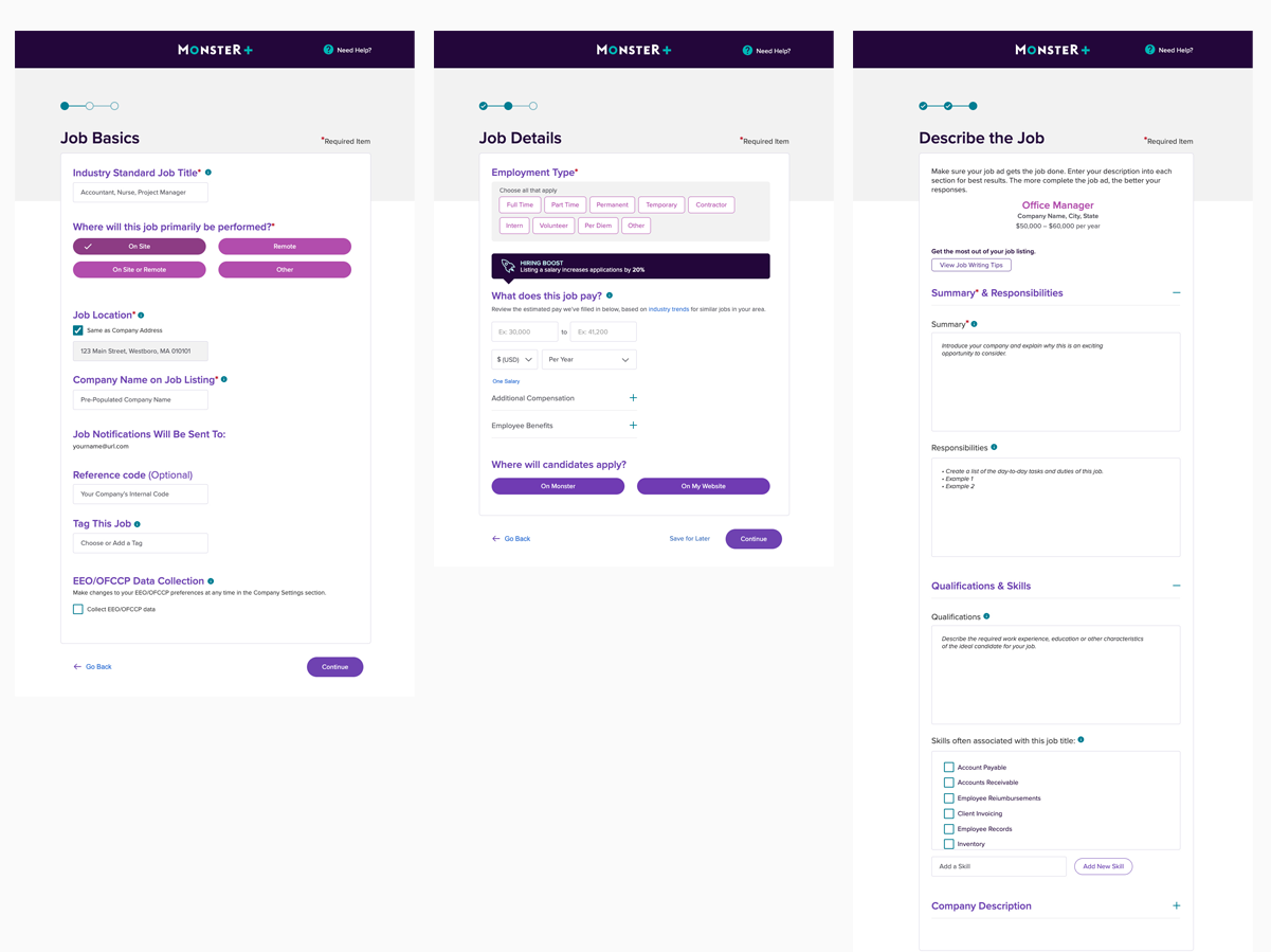
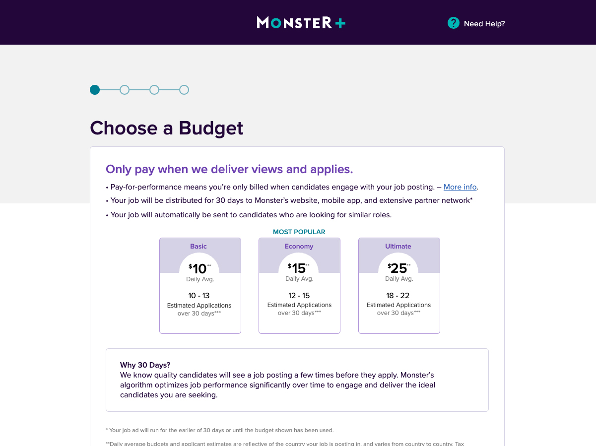
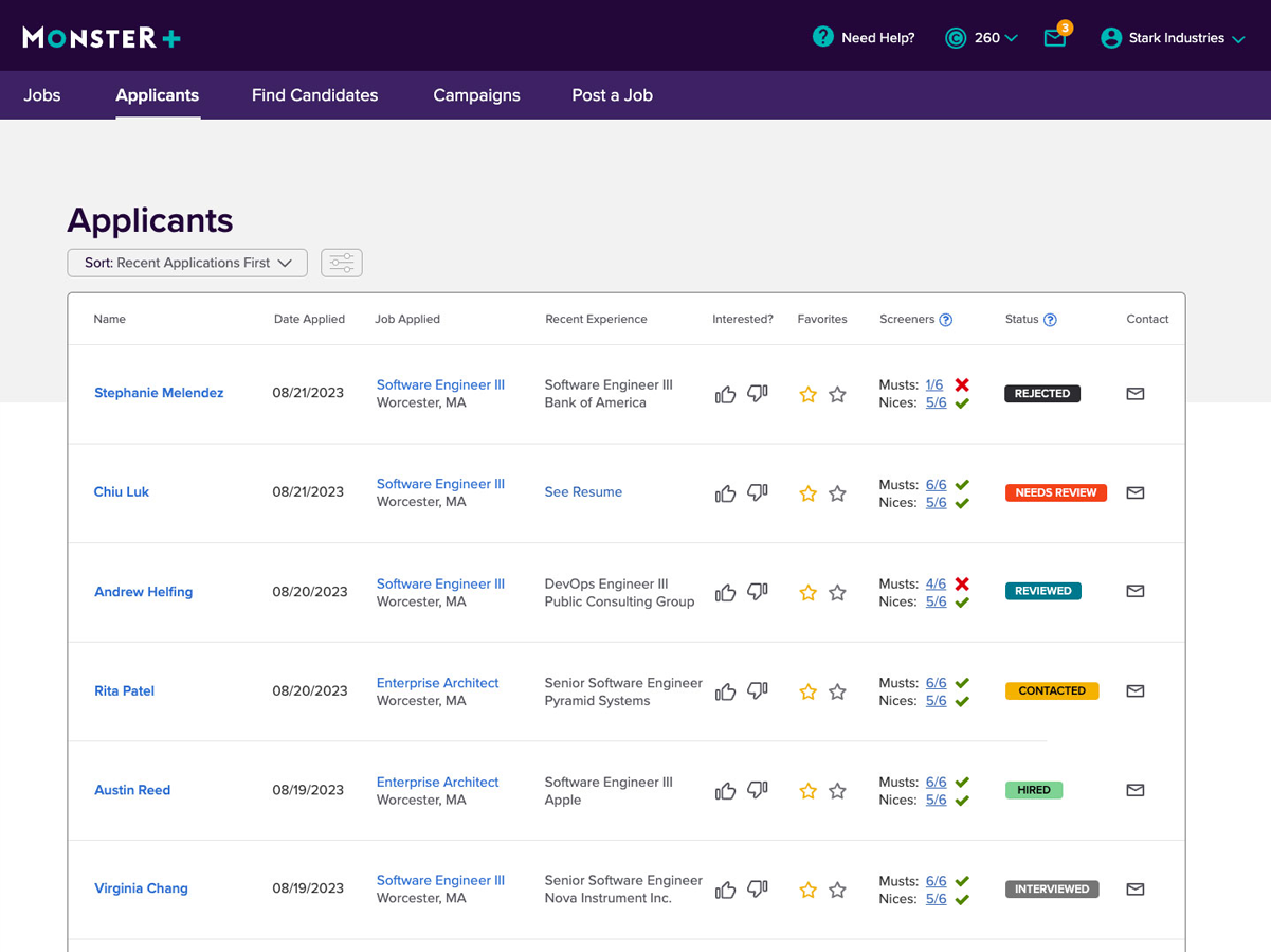
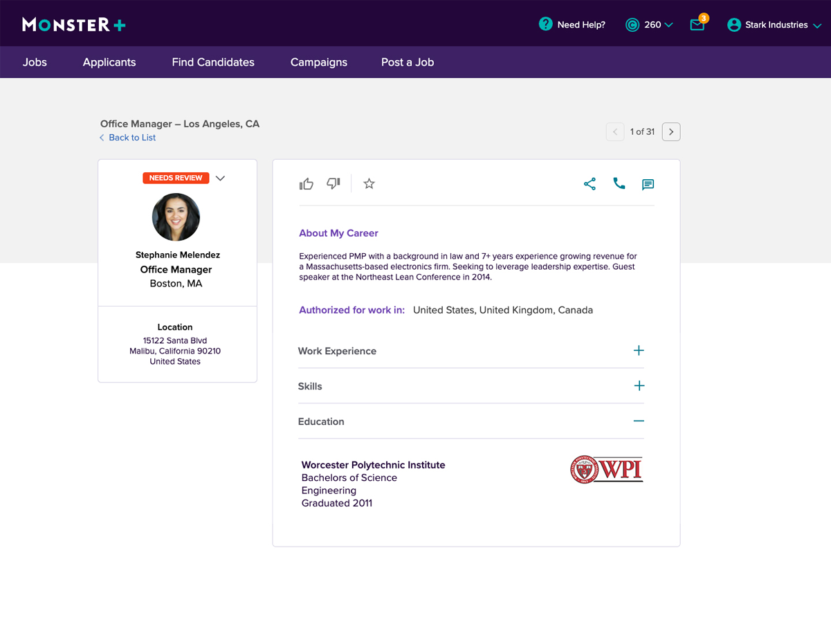
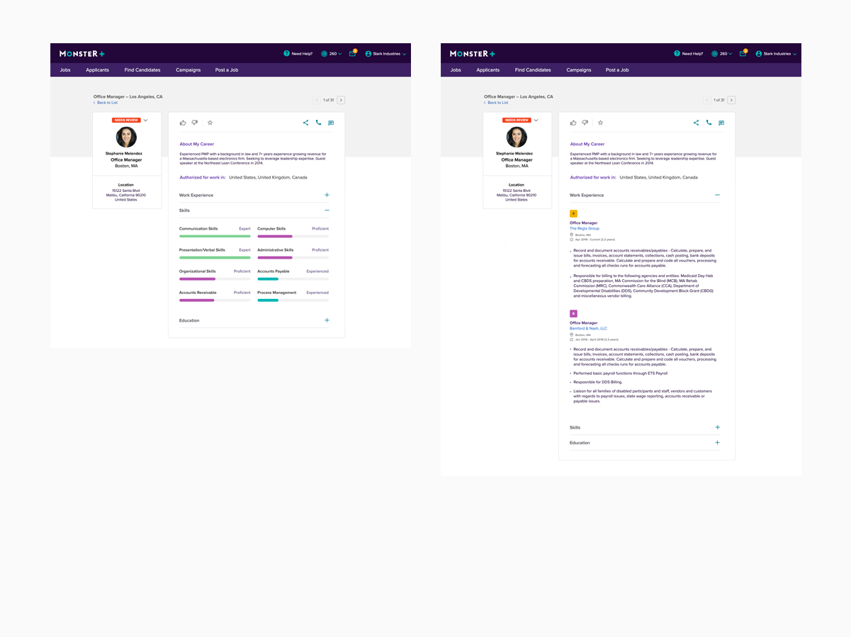
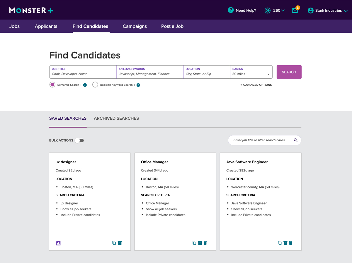
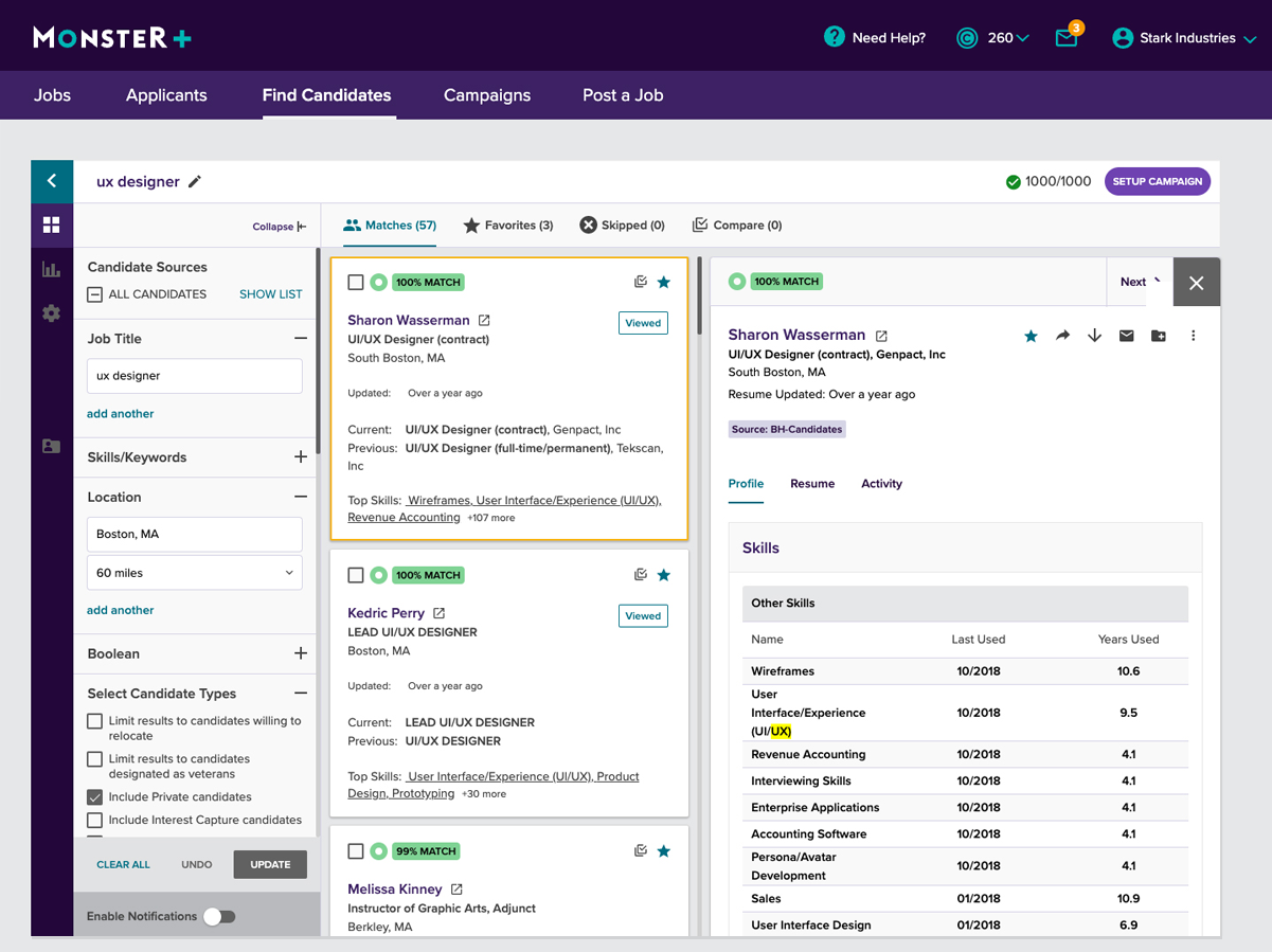
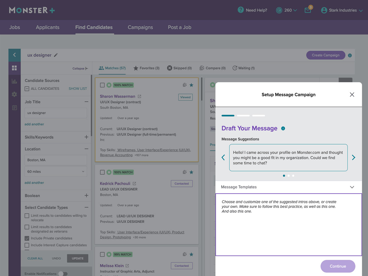
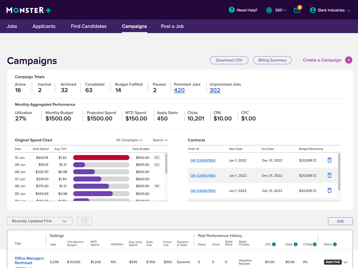
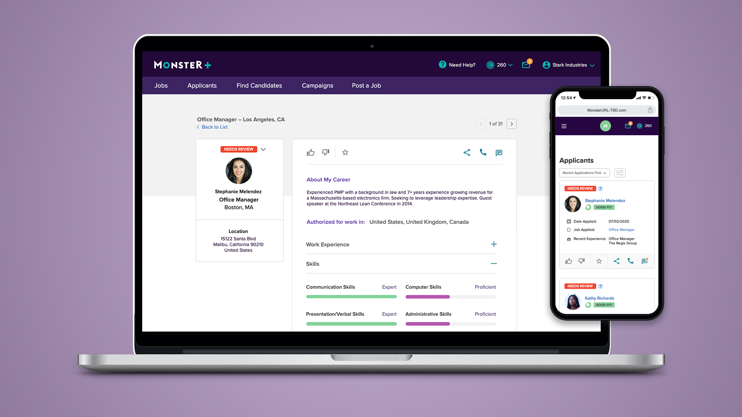
FINAL DESIGN
Simple & Clean
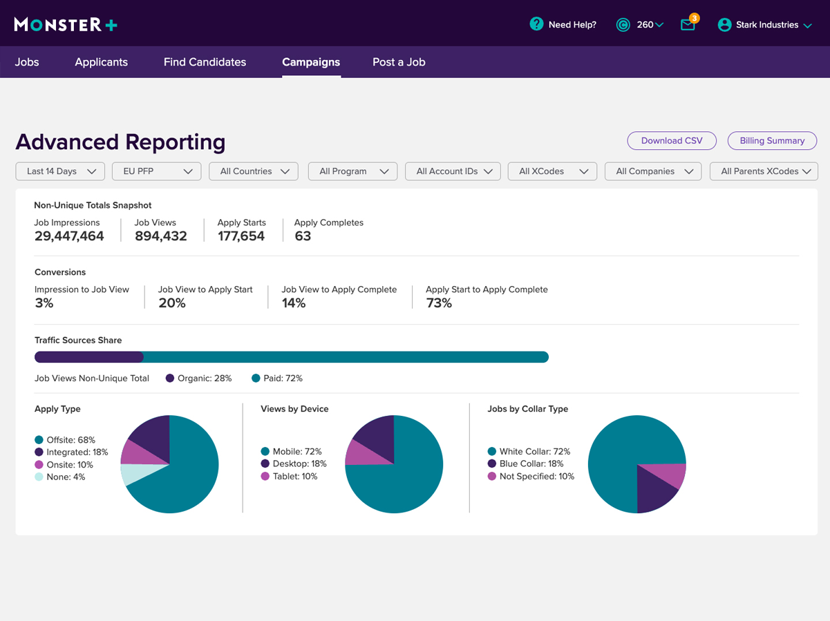
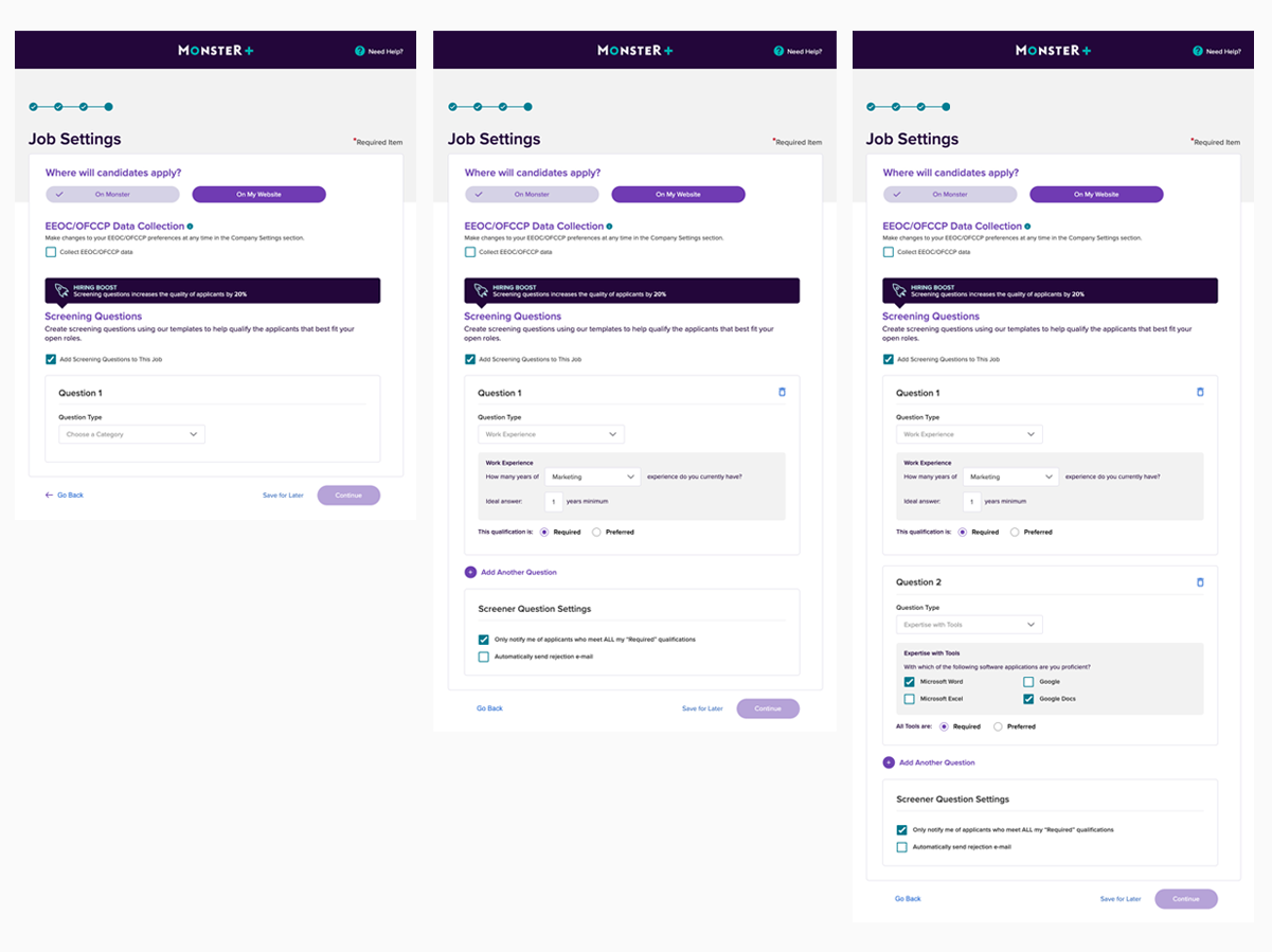
Users reacted positively to a clean interface with lots of negative space. They said it was easier to scan and digest the content, it didn’t feel overwhelming, and was easy to use.
But the choice to go with this design was ultimately guided by three important factors:
It tested well with users; they found it easy to use and read.
The marketing team felt that it was on-brand and visually consistent with other Employer initiatives.
The dev team was comfortable with the visual systems that needed to be implemented, and could build them in a timely manner
IMPACT
Job Posting completion rose 31%
Customer Support calls went down 22%


