HIRING.MONSTER.COM
Monster+ Prototype
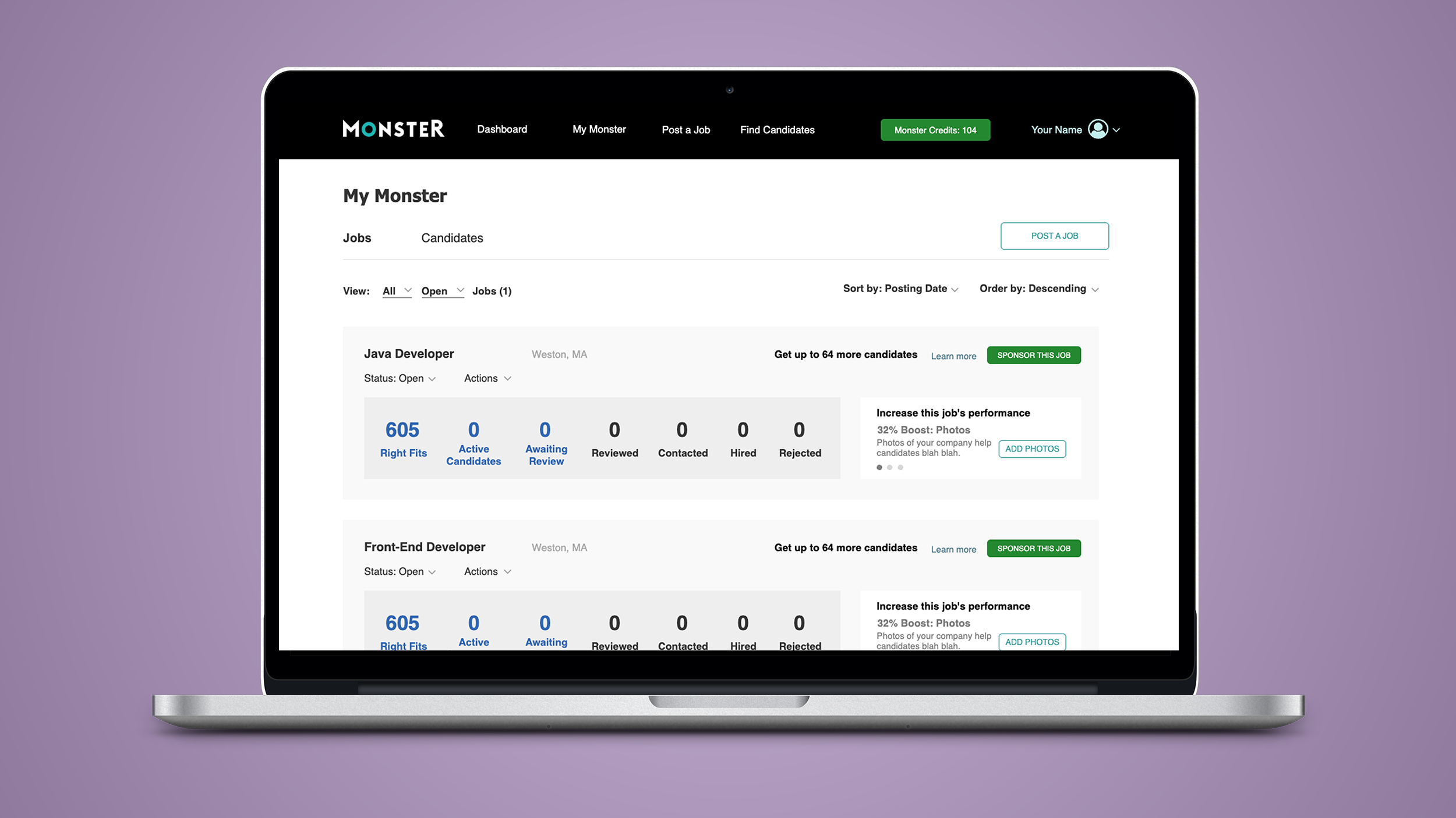
A hi-fidelity prototype for a new self-service B2B hiring portal, aimed at small-to-mid size businesses.
PROJECT OVERVIEW
Monster is a global leader in connecting people and jobs. For 30 years, Monster has worked to transform the recruiting industry.
Hiring.Monster.com is an Employer portal that allows business owners, hiring managers, and recruiters to post & promote job listings, source candidates, and review and manage applicants.
Monster’s business model catered to Enterprise level clients, leaving a large client base unattended. I was tasked with identifying the needs of small-to-mid sized business owners, and crafting a set of features that would transform the Employer experience into a self-serve application that reduced the need for Sales and Customer Service’s hand-holding of new clients.
ROLE
UX Researcher
Conducted research and interviews
UX/UI Designer
Created all UX flows, wireframes, and prototypes
TOOLS
Axure
UserTesting.com
UXPressia
Office Suite
PROJECT LENGTH
6 Months
METHODS USED
Competitive Analysis
User Interviews
Persona Creation
User Journeys
Wireframing
Hi-fi Prototyping
User Testing
EXPLORATION & DISCOVERY
INTERVIEWS
I recruited 25 small business owners and/or hiring managers on UserTesting.com from non-food service-related companies that ranged from 5-100 employees. (food service is its own niche market and not the target of this project).
Interview highlights:
These people are crazy-busy
Small business users are stretched thin, both mentally and fiscally
No time to worry about where they’ll find new employees
Need a service that doesn’t take a lot of time
Need to see results quickly
Every penny matters – cost is a concern.
Doesn’t usually have dedicated resources or experts doing their recruiting in-house.
Doesn’t have expertise in this area; they can be intimidated by writing job descriptions, promoting their listing and the screening/interview process.
PERSONAS
Based on the interviews, we established three new personas for our new employer portal, but decided to focus on two, as they were the largest portion of our audience:
Emily, the Small Business Owner, who represents 65% of our projected new userbase (organizations with between 5 and 50 employees),
Ashley, an HR Generalist, who represents 30% of the userbase (organizations with 50-250 employees).
With these users in mind, I turned my attention to our competition to see what they offered Emily and Ashley.
COMPETITIVE ANALYSIS
Analyzing our competition was necessary to identify industry best practices, and to discover ways to differentiate Monster.
I reviewed a host of sites:
Linkedin
Indeed
Craigslist
Facebook
Zip Recruiter
Simply Hired
Flex Jobs
Much of our competition had already targeted small to medium businesses. We had a lot of ground to make up to gain parity with industry leaders.
After reviewing the competing sites and taking copious notes, it made sense to audit the existing Monster Employer Portal and see what we had to work with.
UX AUDIT
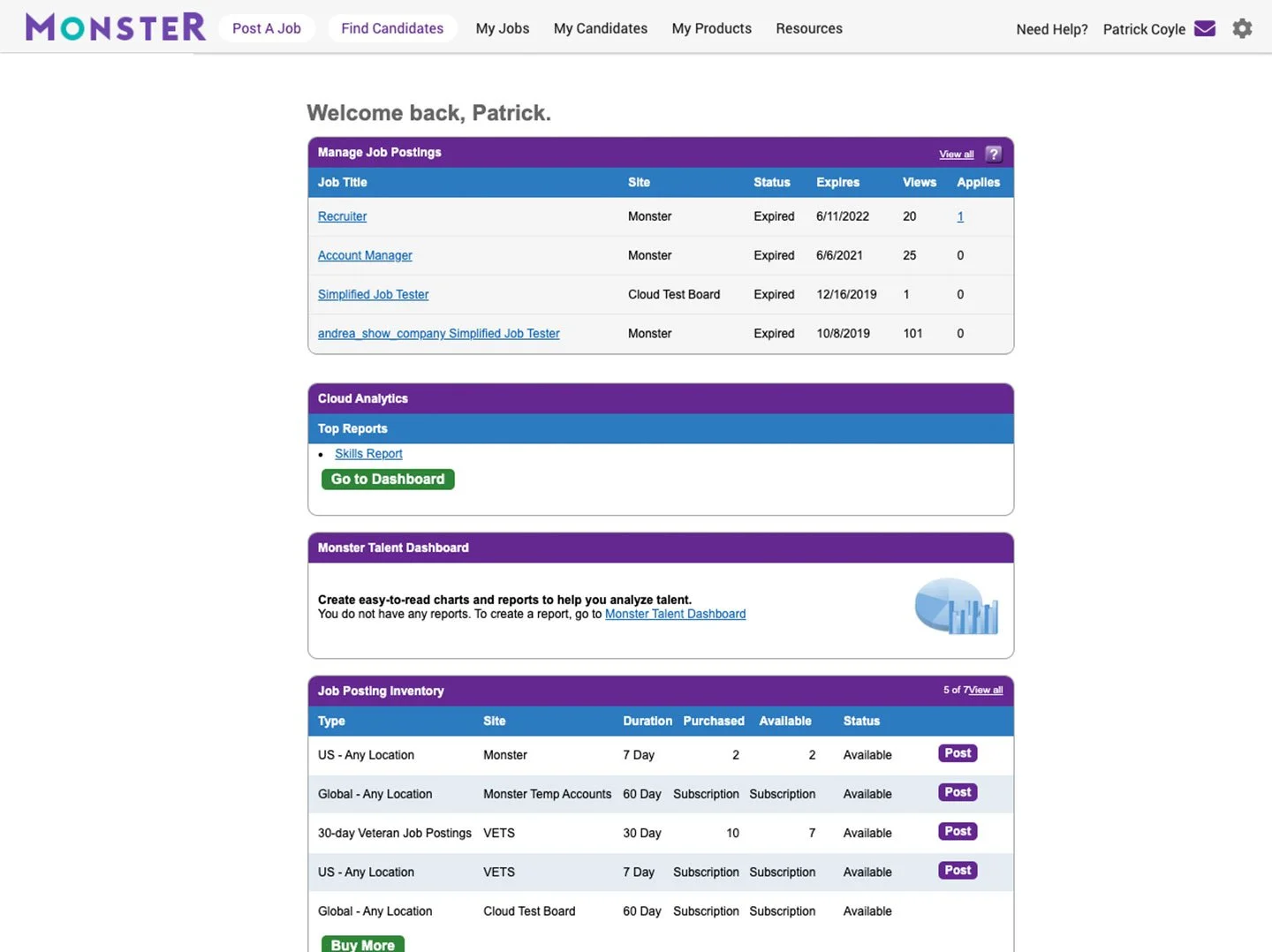
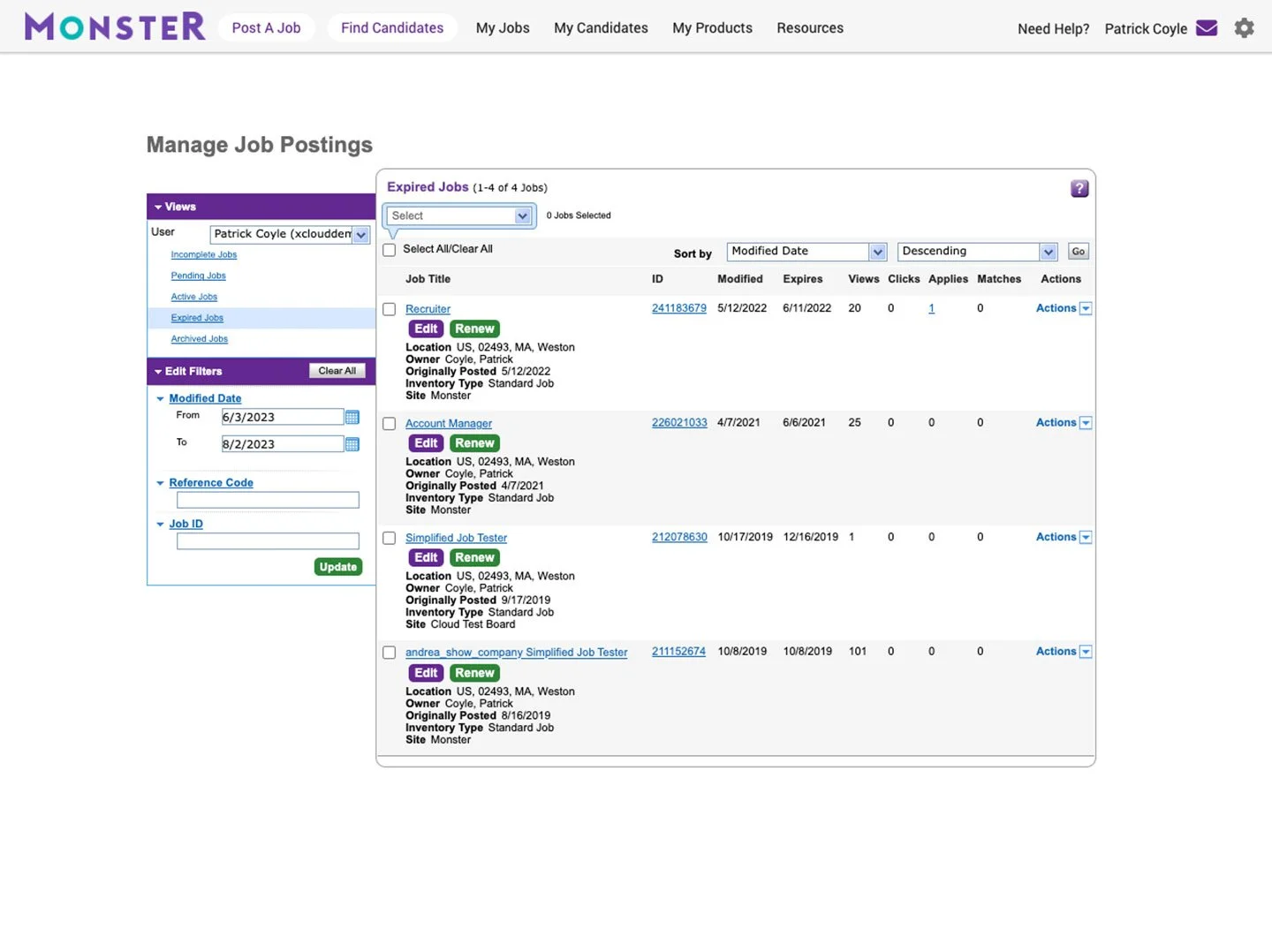
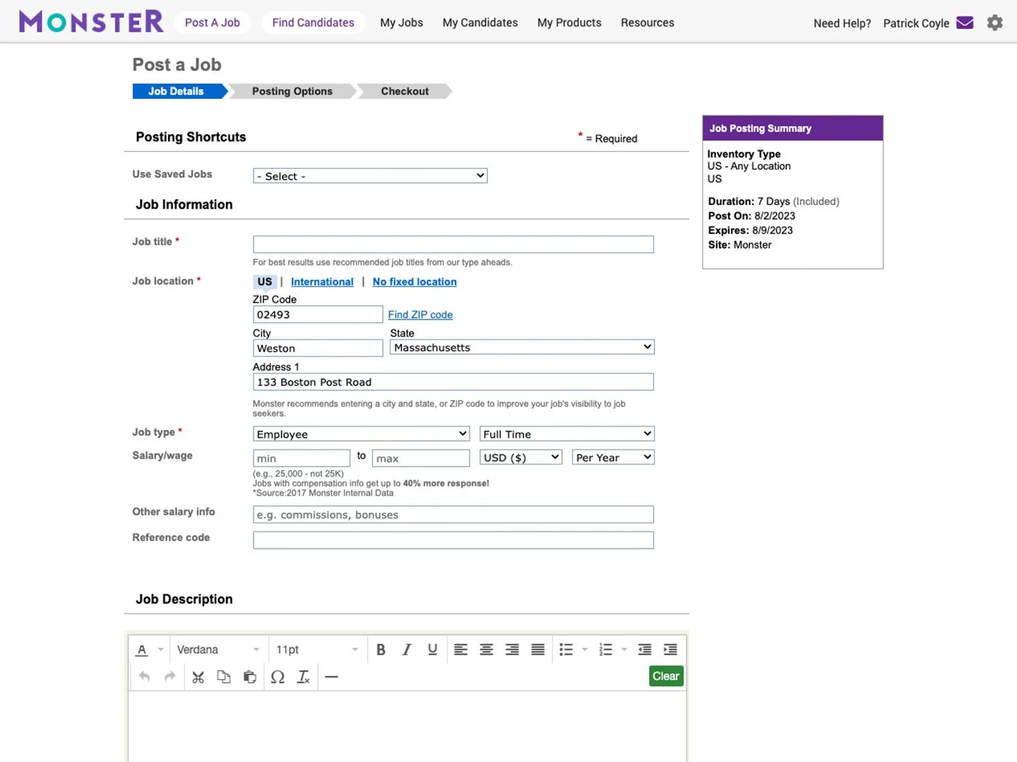
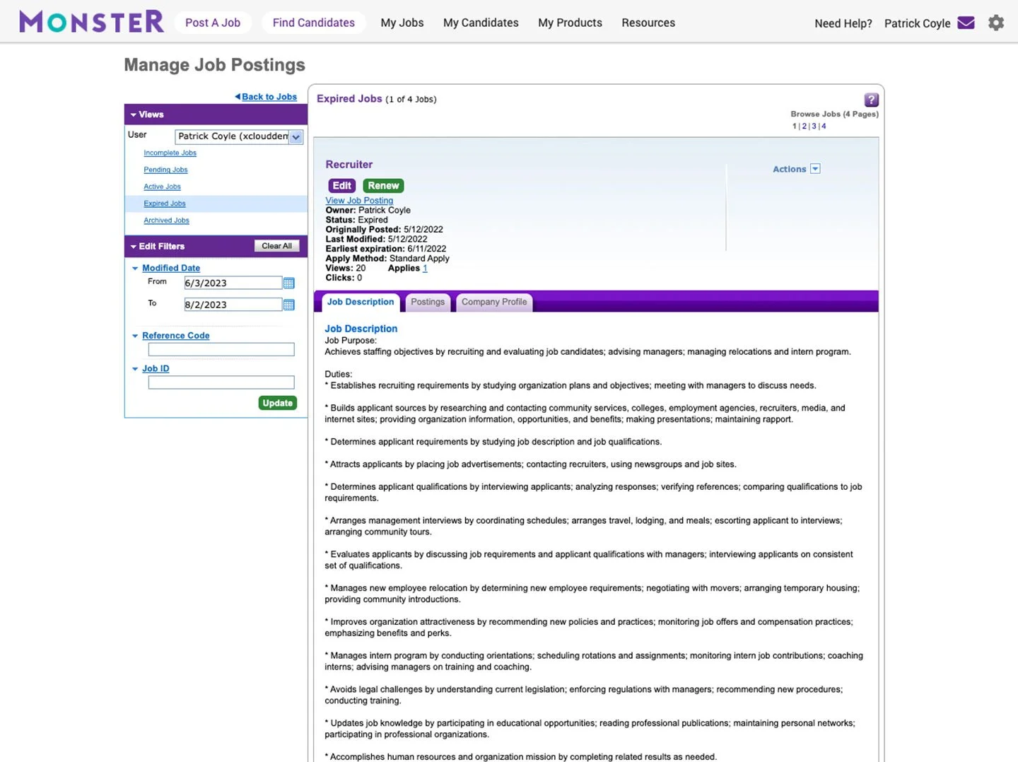
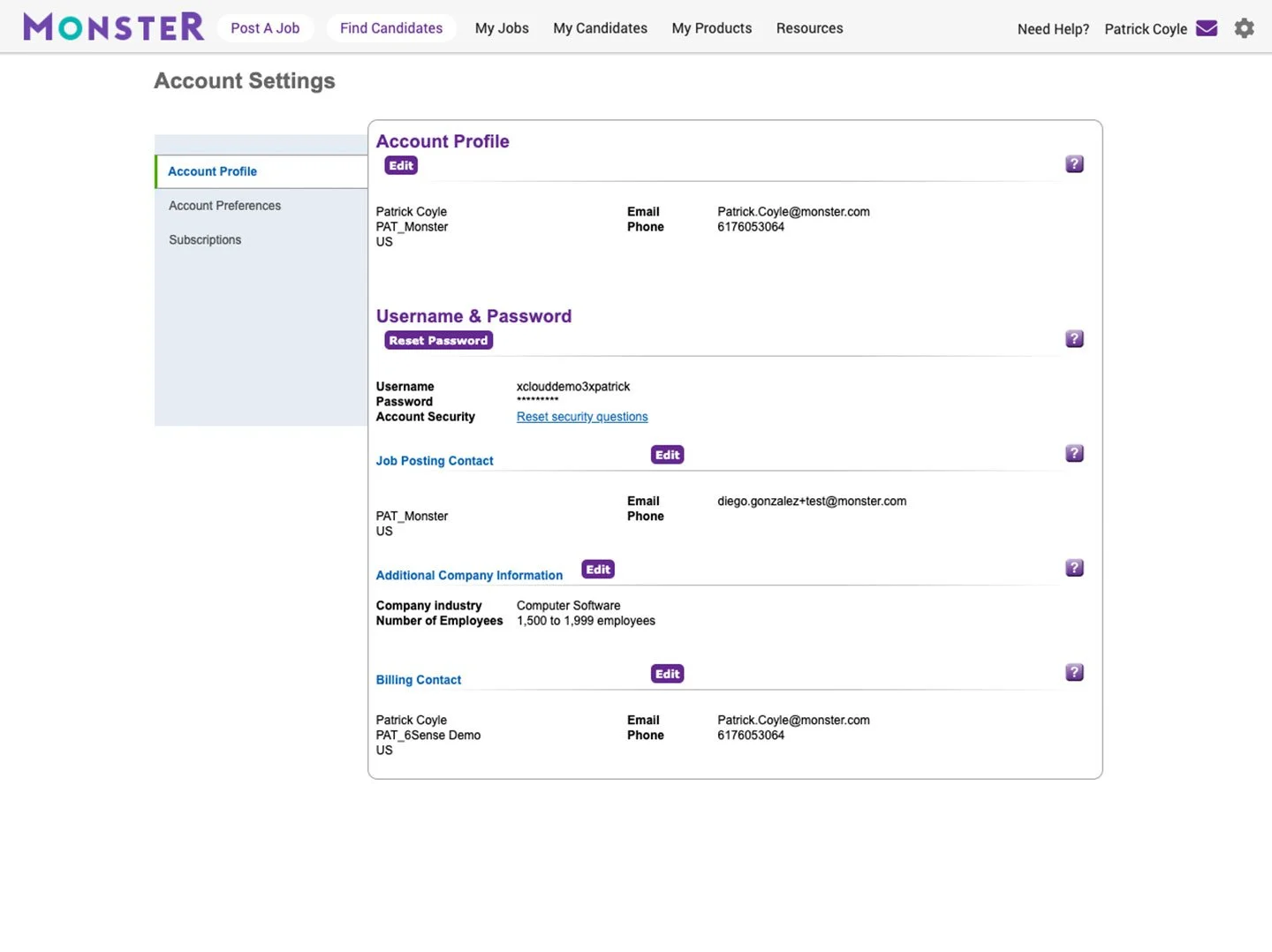
I reviewed the legacy Monster Employer Portal to see what, if anything, was worth keeping in the new site.
Key findings:
A confusing taxonomy with redundant navigation
A clunky UX with many tacked-on features
The UI wasn’t intuitive, and frequently required instruction from customer service
All the help features took the user out of their UX flow into the Customer Support section of the website
In order to create a clean, smart flow that integrated new features, the redesign was going to be a gut job, tearing down the whole thing and starting from scratch.
SKETCHES
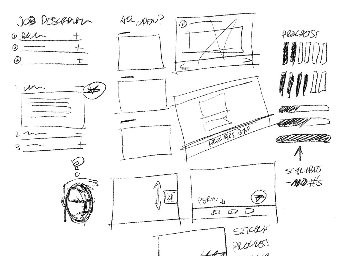
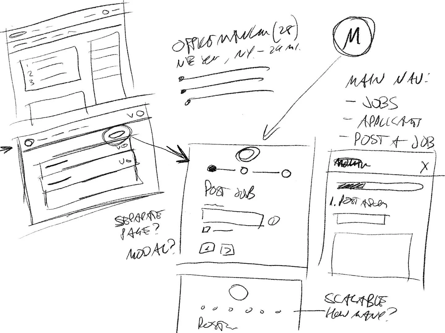
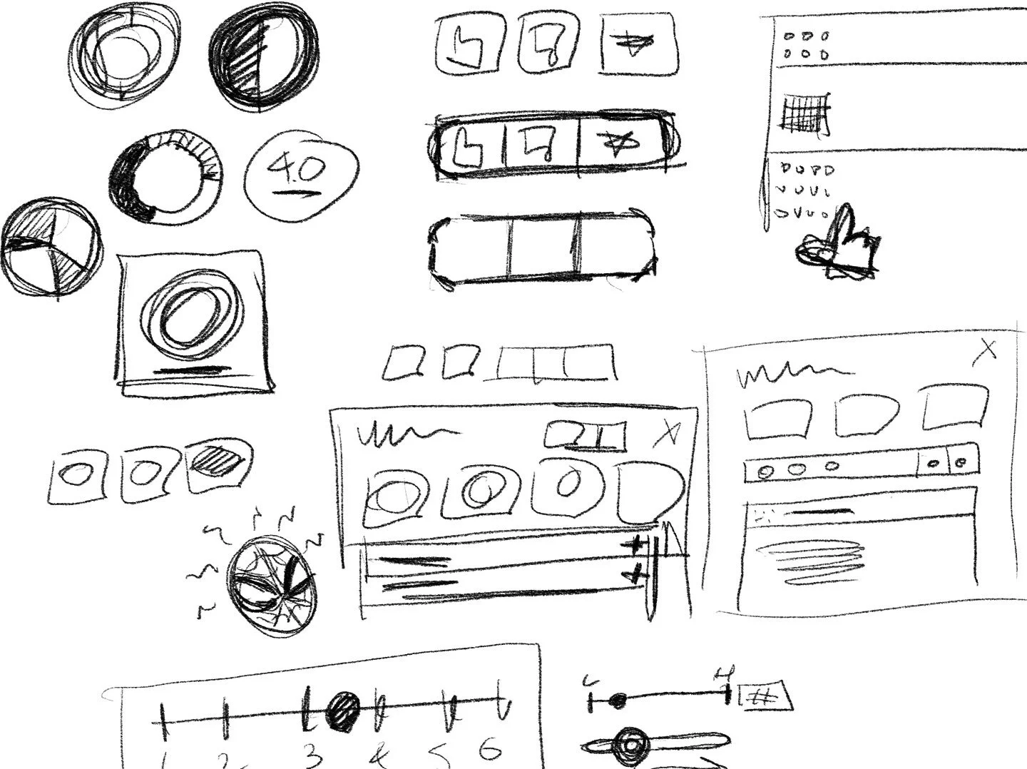
I like to get off screen and sketch, pencil on paper. It helps my brain switch gears, and I can create thumbnails quickly with pen or pencil, thinking visually and iterate within seconds.
While sketching, I also made notes and played with a new taxonomy outline. I found the site could be simplified down into three sections: post a job, review applicants, and search for candidates.
With some ideas sketched out, it was time to start wireframing so I could present my ideas to stakeholders in a more formal way.
UX DESIGN PROCESS
FLOWS
Flows presented themselves as I sketched thumbnails for pages and features. From there, I created a more formal flow for each persona, this time in Axure, to show at a high level how the user will move through the application. Formalizing the flow helped me create a “to do list” of the wireframes needed.
WIREFRAMES
I created grayscale wireframes based on my sketches and flows, keeping in mind our new personas and their needs. These wireframes would allow me to present my ideas to stakeholders. Creating them in greyscale removed any feedback on look and feel or branding, and kept our discussion focused on features, taxonomy, and dev LOE.
Armed with wireframes of about twelve key pages, I created a presentation for the Product team leadership, collected feedback, and iterated a few times until I had consensus on the major pieces that would go into the site. This finalized the nav structure and basic taxonomy, and allowed me to dive a level deeper into flows and functionality by creating a Prototype.
PROTOTYPE
For Prototyping, nothing gets closer to a fully functional HTML prototype than Axure, which allows me to show how small elements within a flow add up to a larger, seamless UX flow.
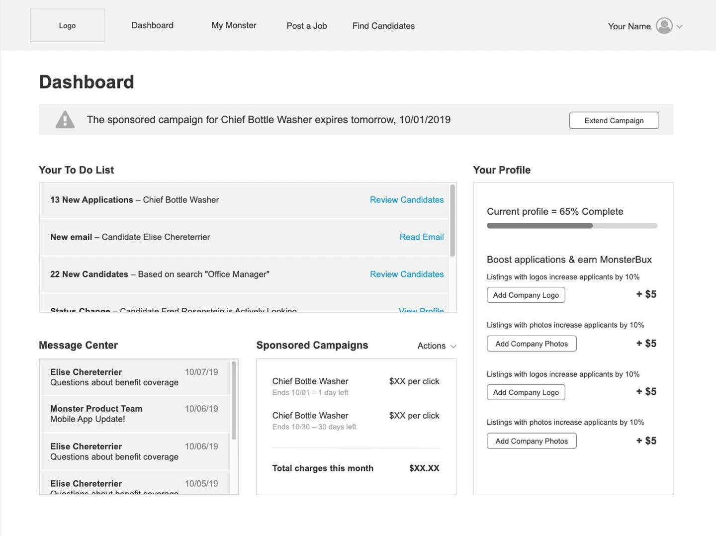
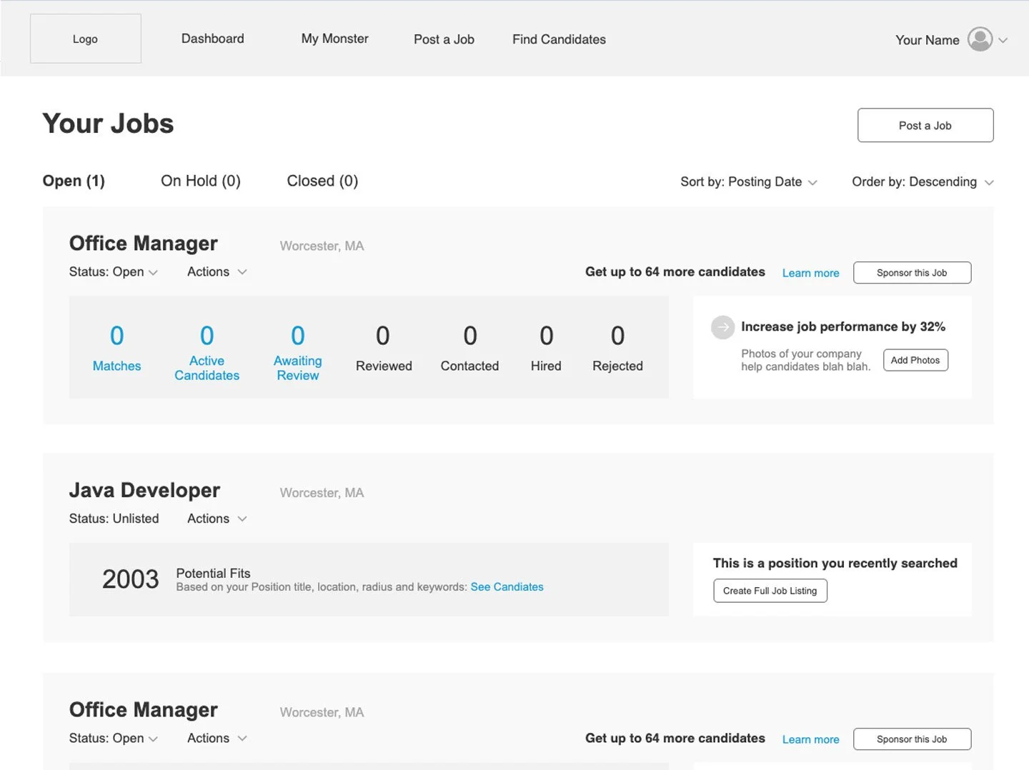
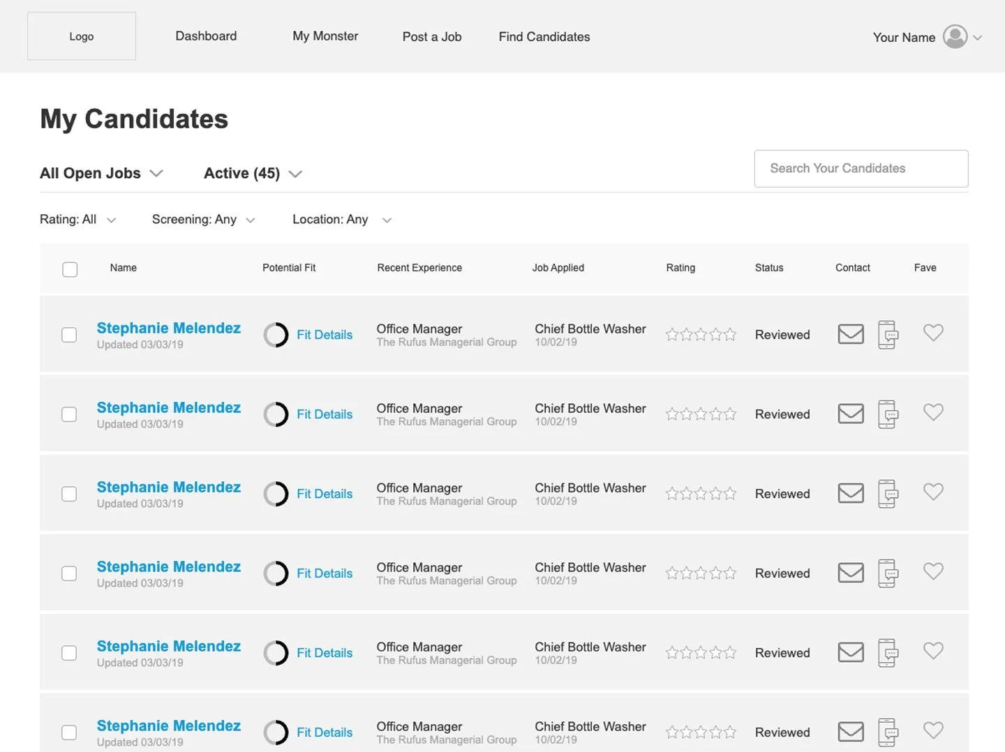
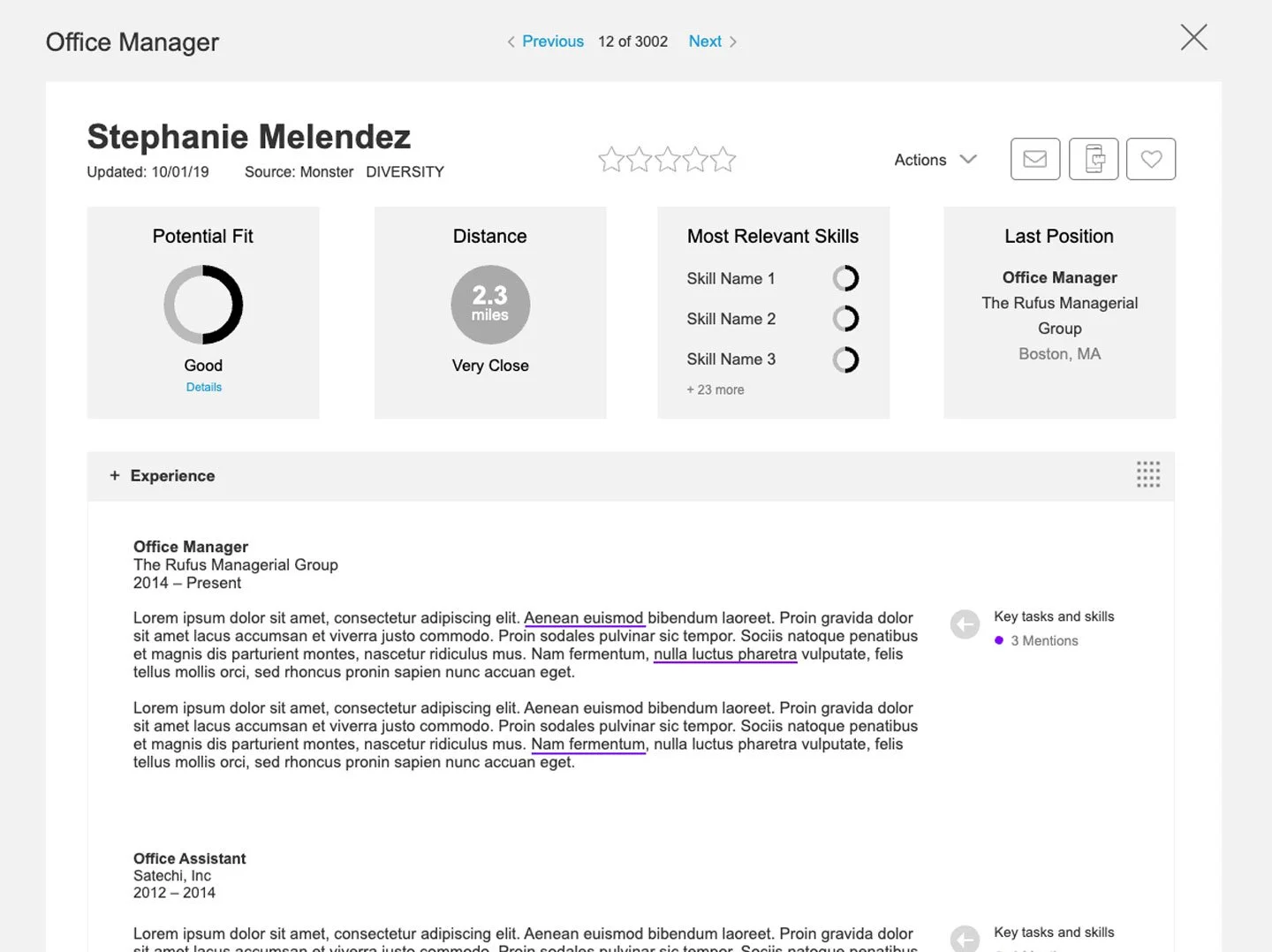
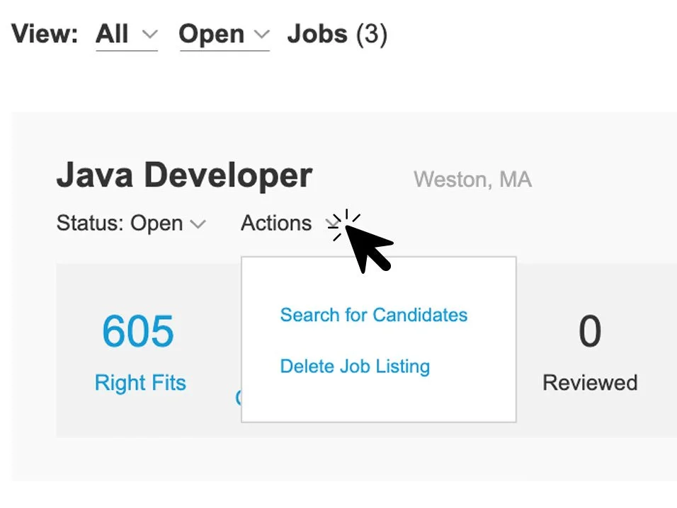
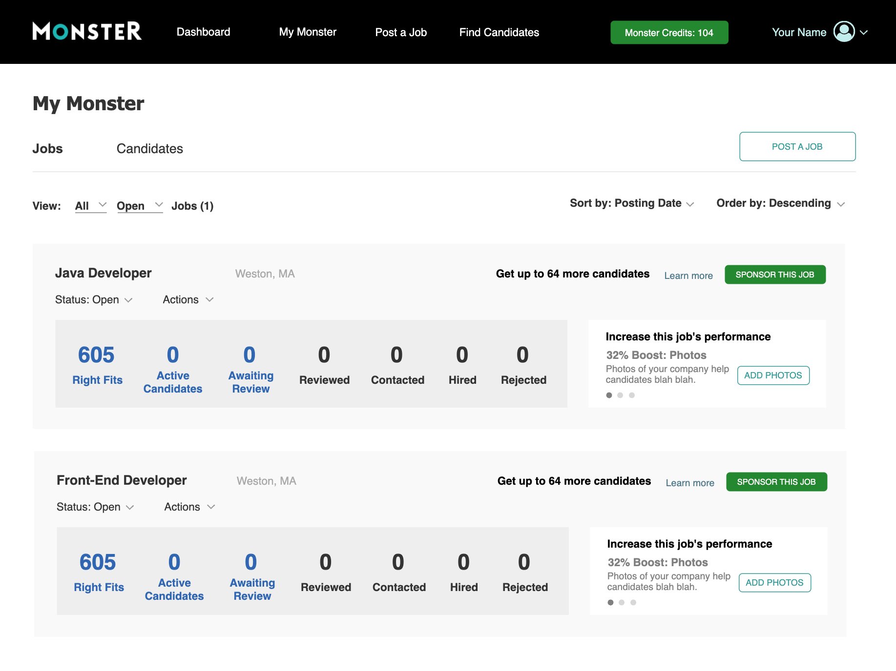
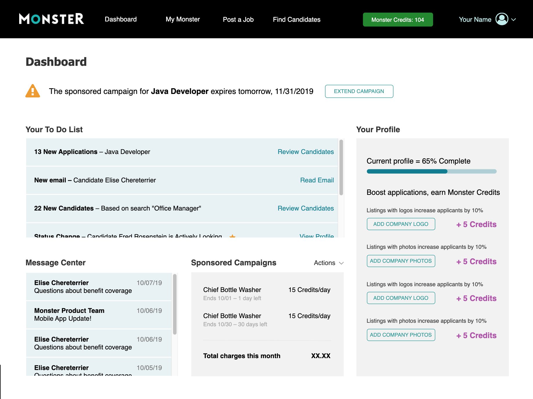
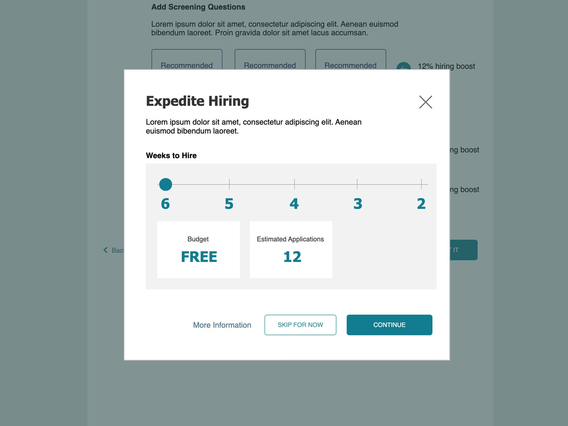
For this prototype, I created a job posting flow, an Employer Dashboard, a Jobs page, Applicants page, and Candidate Profile page. The interactive elements let me showcase how easy it could be for new users to sign up, post a job, and promote it with a budget, all of which were the pain points from both a user and a revenue standpoint.
TESTING
Using UserTesting.com, I recruited 16 small business owners and 8 HR generalists who were actively hiring. The hi-fi prototype allowed them use our proposed features and tools in a practical way, with real jobs in mind.
I moderated twenty-four sessions with a written script, and improvised questions as opportunities arose. At the end, participants would rate the features and functionality, and rank them from the most to least valuable.
This feedback allowed us to narrow the feature list to a manageable scope, and provided insight that settled internal debate about which features were most important.
ITERATION
The prototype was iterated upon for months, re-testing the updated prototype every three or four weeks. This created a deep understanding of what our users were looking for, how to talk to them, and where the friction points would be.
Highlights:
We Don’t Need a Dashboard
Users didn’t want an Employer Dashboard, they just wanted to go straight to the list of their jobs.
Business Owners are Not Copywriters
Most small business managers or owners didn’t know how to write an effective job description. They were looking for templates and recommendations on how to make what they wrote better.
“I Don’t Have Time for This”
Being so busy, small business owners would post their jobs in fits and starts; they didn’t have a big chunk of time in which they could really think about their listing.
Perceived Speed and Value is Key
After creating several versions and testing with users, we found that user didn’t care how many pages there were in the job posting process, as long as they were quick to get through, and added value to their job post. Perceived speed and value was what they judged our site on.
These items, among many others, influenced the UI elements and overall flow of the final design.
FINAL PROTOTYPE
The final prototype was created based on multiple rounds of user feedback and went through many iterations. I then used it to shop our new product concept around to company stakeholders in engineering, sales, marketing and other product groups.
I focused on new features that appealed to the small business userbase, and shared feedback from testing to back up my choices.
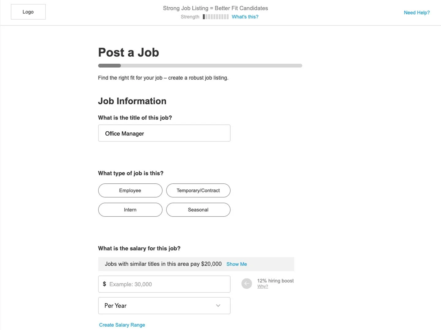
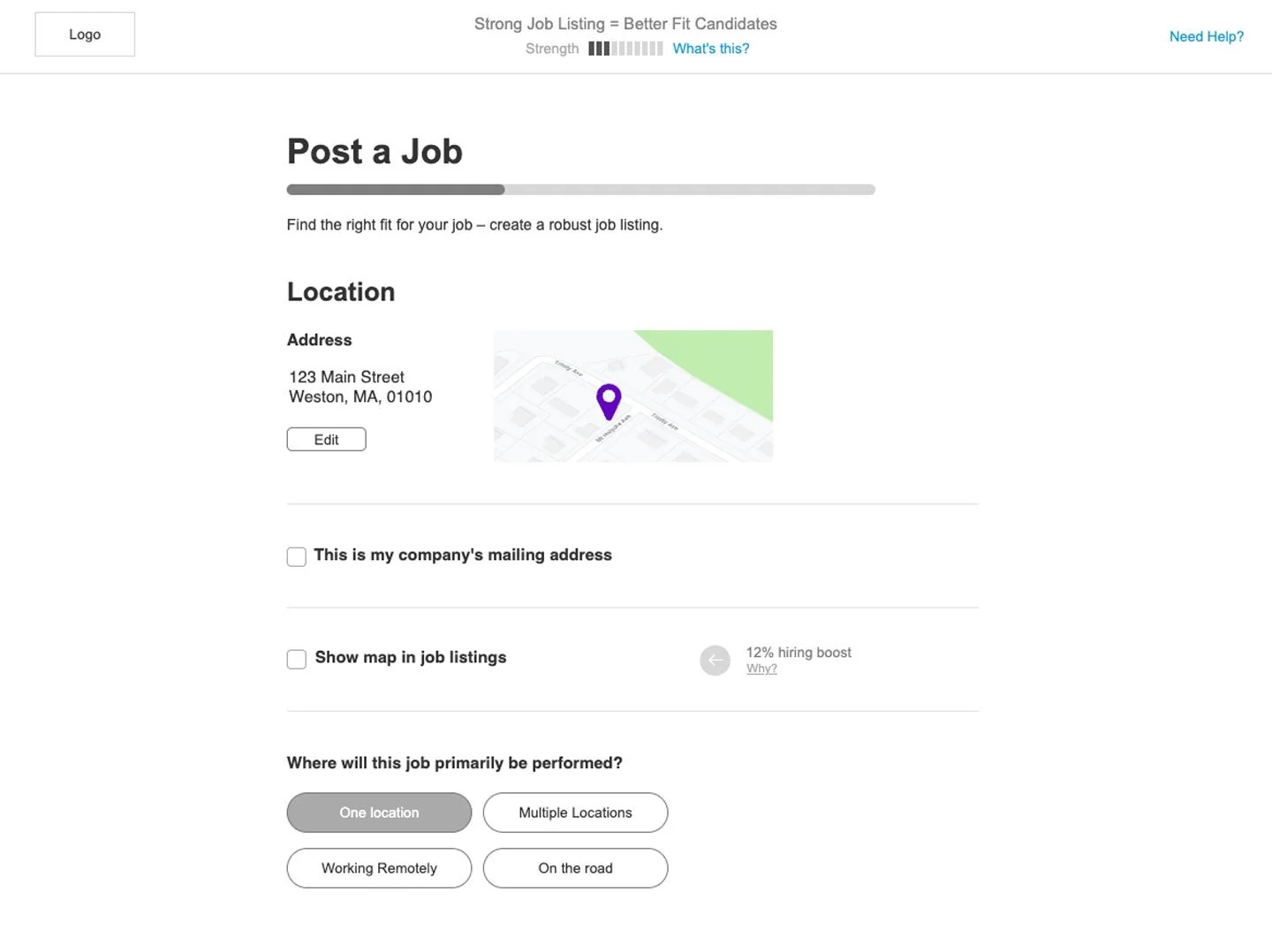
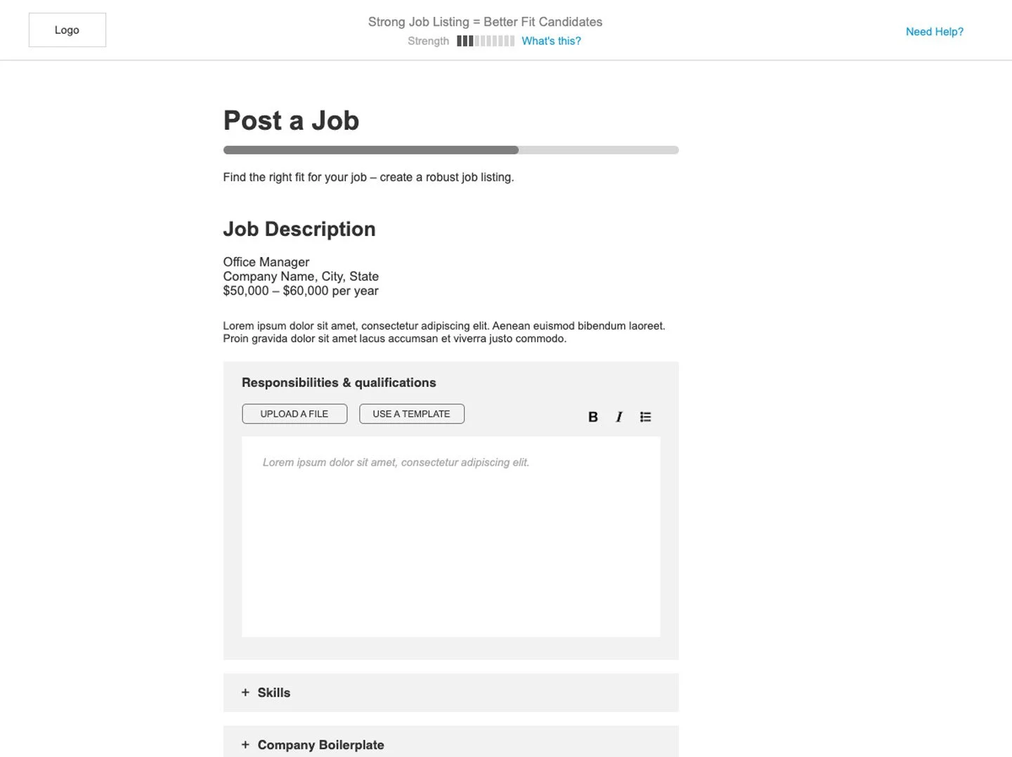
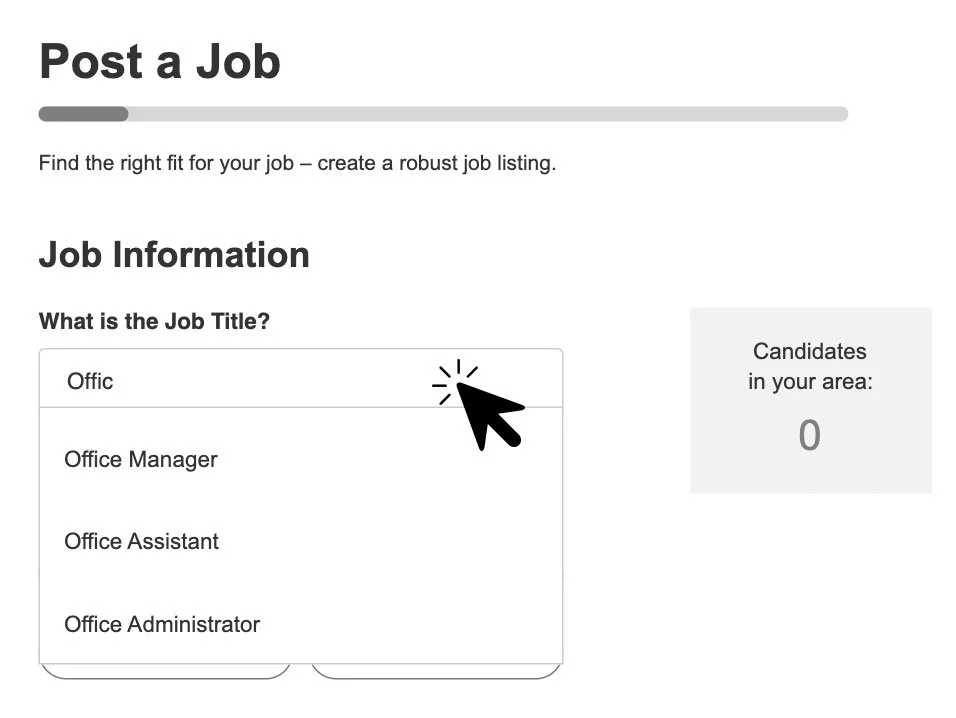
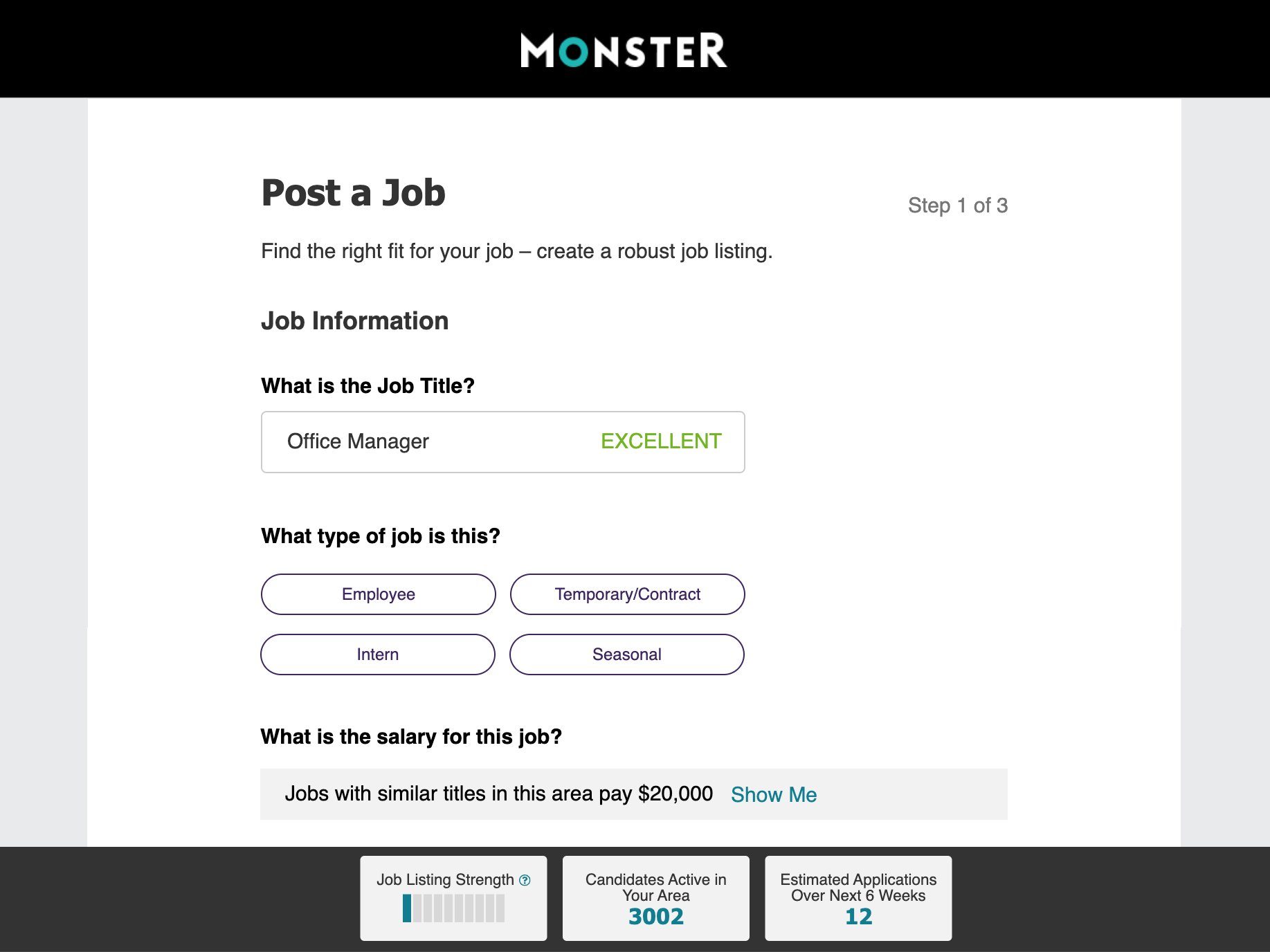
Break it up: A multi-page job description flow that broke the process up into logical, bite-sized bits
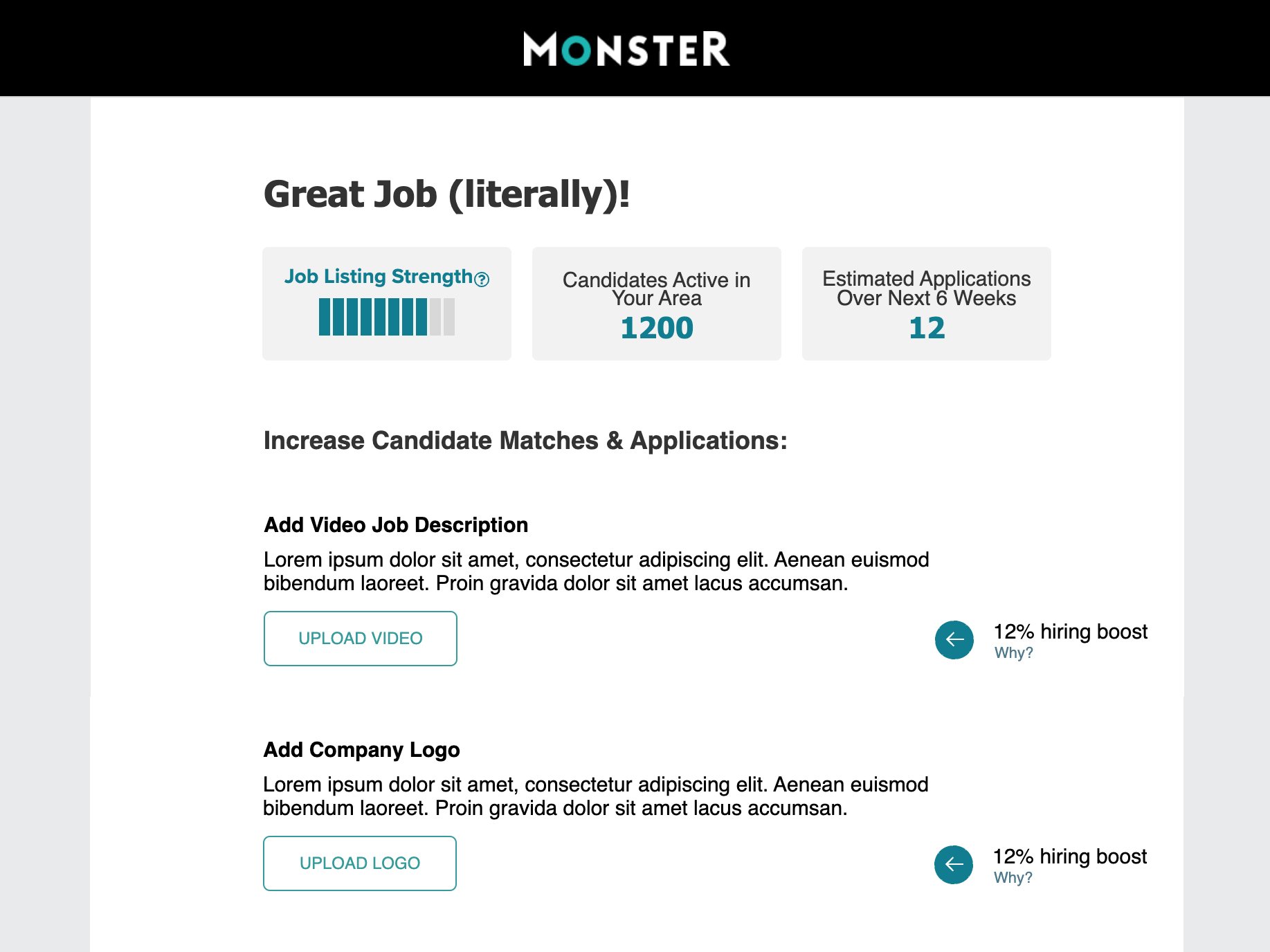
The Hiring Boost: many of the items in the job posting flow are optional, and likely skipped by users. We pulled user data and inserted it as a point of interest to let users know that though optional, that piece of info will yield more and better applicants.
Strength Meter: This measures how effective the job listing will be, giving real-time feedback as the user adds more data.
Candidates in Your Area: Similar to the Strength Meter, run a real-time count of candidates that Monster knows would be a good match for the job listing in its current state. The better the listing, the more candidates that match.
Location Feedback: To help employers understand why they might not be getting as many candidates as they hoped, we visualized where Monster knows candidates to be, based on the location that the employer listed. We would point out potential issues like long commutes, or a known shortage of talent in their area.
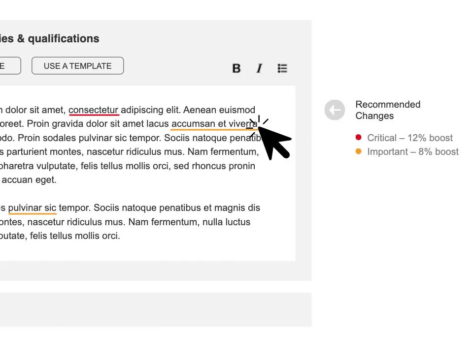
Recommended Changes: I envisioned using AI to evaluate job descriptions in real time, and rate them as “Critical” or “Important” fixes. The UI would operate like Grammarly or similar features, underlining the problematic sections, and offering suggestions upon rollover.
Save for Later: Seems obvious, but not all sites include this. Knowing that small business owners don’t have much time, we included the ability to save job listings as drafts to finish later.
Game-ify Profile completion: Users are more likely to take extra steps and create a more robust Employer Profile when they can earn free credits for each step taken.
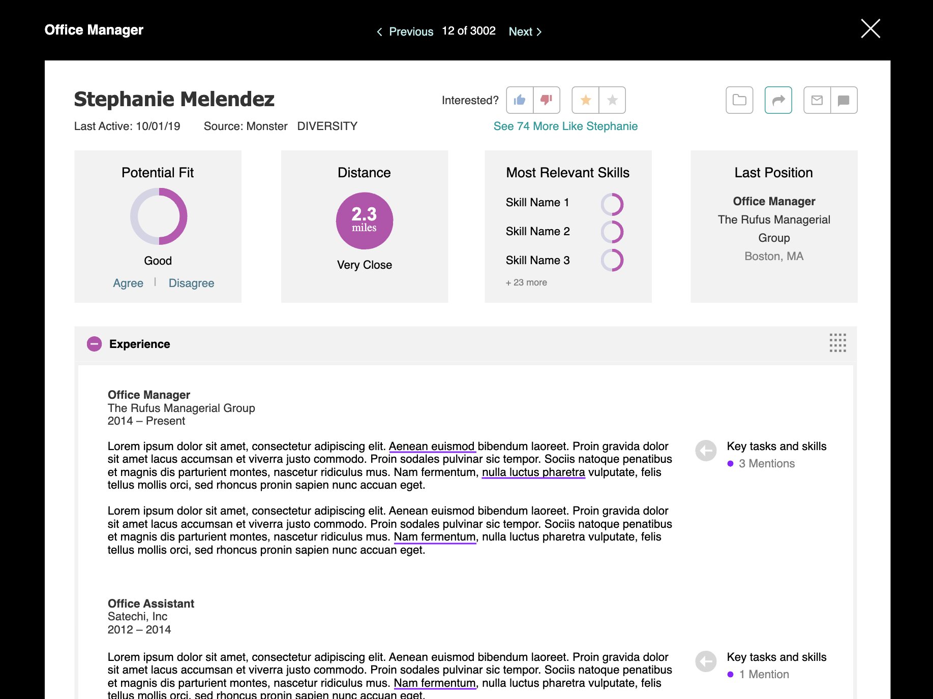
Key Tasks & Skills: Reviewing candidates takes time that small business owners don’t have. This feature would call out key phrases or skills that Monster identified based on the job title. Users could skim through the candidate profiles more quickly, finding the right fit for their open position.




IMPACT
Users rated the new prototype a 6.1 out of 7 for features and functionality
91% of users said they would “definitely use” this product
84% of users said the prototype “Contains what I need to easily post jobs and review candidates”
78% of users said the prototype “Has better features than the service I currently use”
This prototype was the foundation for what became the Monster+ service.
LEARNINGS
Small Business Owners Need All the Help They Can Get
Our new audience needs things simple, quick, and cheap. Whatever we can automate for them, we should. We should call out opportunities for improvement that involves little to no work from them. They need a trusted partner that will deliver for them once they set things up.
We’re Just Another Tool
A hiring platform is no different to the small business audience than an office supply distributor. As long as we keep our end of the bargain affordable and valuable, they’ll stick around.
No Sizzle, Just Steak
Our users don’t care about bells and whistles. They want a straightforward interface with a focus on ease-of-use. These aren’t power-users, and the final UX/UI should reflect that.


